What's new

Keepin it real....

  • Thread Starter 🔹
  • Moderator 🛠️
  • #16
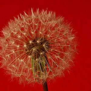
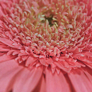
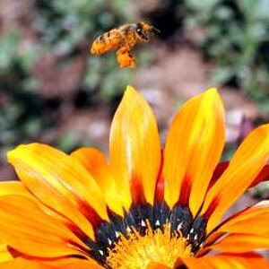
What i call this :"The Falling Beauty"
What i like: the color scheme, which i love to be in my palette; i like the nuances, which is subtle
What i suggest: It is falling, at least for me...so i wanted more space above. Also i wanted the flower to be completely within the frame; i think you had trimmed some portion from the right, right?
Conclusion: I liked it very much :D
I did crop off some of the right side. I felt that it made the picture too centered to leave it in the shot. But I will gladly look at that again.....=) Thanks babe!!

It is hard to judge.. if you matted it with nice black frame, probably really good.


Have I said how much I hate TPF white background? Ridiculous.

Once you go black , you can't go back. Check it out on my flickr if you want to see it on black........;)
 
Well, it is courageous of you to share with us your experiments. It's hard to improve or innovate if you stay in the comfort zone, which I can see you're clearly out of. A bit like a well-known band - they want to try new stuff to expand their artistic repetoire, and the audience wants to hear the oldies. So bravo for going where you're not yet sure of the lay of the land - in that direction lies both failure, and growth. In fact, growth without failure is an oxymoron. So I would love to see more "ooopsies" on the way to "wowsies".

*** going off to search out Mishele's flicker thread **** :hugs:

OK, I'm back. Whew! you definitely have the "eye", Mishele. And consistent in your experiments is the effective use of light and depth of field. Beyond the technical, the way you balance the image and use the visual elements (sometimes centered, sometimes on the power points, sometimes elsewhere) to lead the eye around the image, it worth studying. I'm thinking there's a book (or many) in your future.

Your work is resembles another photographer who I admire - Freeman Patterson. Links to some of his images are below:

http://www.theguildpublishing.com/dealer/print37.htm

http://www.freemanpatterson.com/print22_impr.htm

If you do a google image search on "Freeman Patterson". you will see many other images by other photographers who were inspired by Freeman's artistry. A little like how your work inspires us.
 
Last edited:
  • Thread Starter 🔹
  • Moderator 🛠️
  • #18
^^^^ What, what...you're giving me a book deal?!! =)
I'm having a lot of fun playing outside of my comfort zone. Amazing, what you can learn about yourself. What you like and don't like. Who knows....maybe one day you'll see a people shot from me..lol <gasp>
Courageous.....nah...lol I've learned from submitting work and looking through galleries that you can't take everything too personal. The art world is fickle...lol

Freeman Patterson....Thank you for introducing me to his work! I'm having fun looking through it.
This is one I liked....
Freeman Patterson : Giclee Prints
I have him bookmarked now so I can follow his work!
 
I like it! I would prefer it with the crop as suggested. How do you get the streak effect? Is it done in pp or did you use a special lens (lensbaby?). Or is it a super secret?
 
  • Thread Starter 🔹
  • Moderator 🛠️
  • #20
I like it! I would prefer it with the crop as suggested. How do you get the streak effect? Is it done in pp or did you use a special lens (lensbaby?). Or is it a super secret?

<evil laugh> What are you going to do for me if I give you my secrets? lol
 
It's different.

While I like it, I wouldn't suggest hanging it next to your other works. At least not this exact image. Maybe play around with the style/technique you're using to really get this on par :)
 
Have I said how much I hate TPF white background? Ridiculous.
Can't be said often enough. Every single forum I've ever frequented (photography-related or not) has different options of backgrounds... Light, dark, colourful, etc. This one, just white... which works with some photos but basically kills the impact of some others. Even Facebook (not a site specialized in photography) has an option to view photos on black. One is left wondering why the biggest photo forum in cyberspace is fine with forcing a white background on everybody. Brings back memories of that classic Avis advertising campaign: "We are only No. 2 in rent-a-cars, so we try harder."
 
Oh, and while I'm post-padding, let me add that I agree with those who say that this one is not up to par with your work.

(But you get a gold star from me for trying something different.)
 
  • Thread Starter 🔹
  • Moderator 🛠️
  • #26
invisible you can't possibly be real!!
Good question....lol I have to go read the rest of what I wrote.....
 

Create an account or login to comment

You must be a member in order to leave a comment

Create account

Create an account on our community. It's easy!

Log in

Already have an account? Log in here.

Back
Top Bottom