
kundalini
Been spending a lot of time on here!
- Joined
- Jul 18, 2007
- Messages
- 13,607
- Reaction score
- 1,937
- Location
- State of Confusion
- Can others edit my Photos
- Photos NOT OK to edit
This is Looking Glass Rock in the Pisgah National Forest. Does it look better orientated in Landscape or Portrait. Or should I just move on to the others shots taken in this area?
Landscape
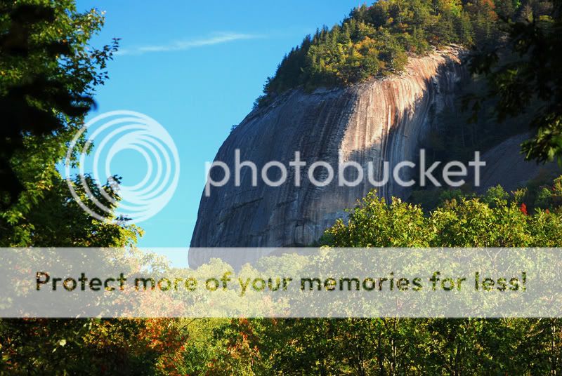
Portrait
Thanks for your comments.
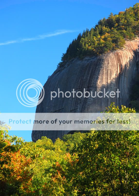
Landscape
Portrait
Thanks for your comments.
")


![[No title]](/data/xfmg/thumbnail/41/41896-54547e935773393100a20b8d9819f5bd.jpg?1619739935)

![[No title]](/data/xfmg/thumbnail/30/30860-944669dcf33f1f20df14586c78ed2608.jpg?1619734480)
![[No title]](/data/xfmg/thumbnail/30/30861-fee88082ba36d0c3b443492fe3f3f1cd.jpg?1619734481)