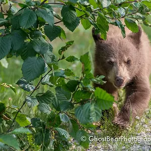
okay, lets see, in the first one, the lighting is horrible, sorry, but it's too bright,
in the 2nd the dappled lighting is distracting
the 3rd has a bit of it too, if it was either of the lighting ways, it would have looked nice.
in the 4th i really don't like the bright white background, so distracting
the 5ht and 6th are quite nice, though it's a shame the branch/leaves are in the way
if the branch wasn't there i'd say no. 6 is my fav.
all in all not too bad, just try to keep those few things in mind for next time.

 [/url
[/url [/url
[/url [/url
[/url [/url
[/url



![[No title]](/data/xfmg/thumbnail/34/34137-37e6e29a844c1214e5b14ce322c7b716.jpg?1734164686)

![[No title]](/data/xfmg/thumbnail/34/34123-da7d55491fec06595061191321c92646.jpg?1734164610)
![[No title]](/data/xfmg/thumbnail/42/42067-88a229e814afcfc8848b3e293d8113d9.jpg?1734176466)
![[No title]](/data/xfmg/thumbnail/42/42327-560f11a37bb209e9091c0fc9e1028cdc.jpg?1734176820)