
chanda95
TPF Noob!
- Joined
- May 23, 2014
- Messages
- 69
- Reaction score
- 20
- Location
- New Mexico
- Can others edit my Photos
- Photos NOT OK to edit
My kiddo. Natural lighting, no flash. Challenge was the hat and the reflection off the fence and wall turning everything orange. It was pointed out to me that in one of my pictures he looked a little orange so with my limited software capabilities I turned the saturation down a notch and hope that helped. He wouldn't stop messing with his shirt so yeah..it's uneven. 
I am trying to take your suggestions in..My mind is overloaded. I got some really great pictures..but then looked at the background and realized I whoopsied..I get focused on the subject and my background turns out completely unlevel. I scrapped those. Had I not been reading some of the threads here I would have (in the past) been happy with those pictures.
I know these have faults so tell me what you see that I can do to make them better next time. Thanks!
1)

2)

3)

4)

5)

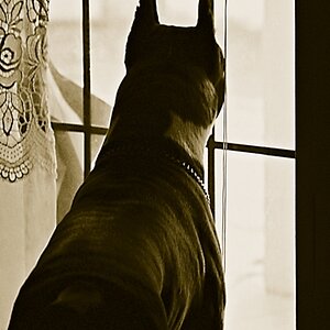
6) I threw in this black and white for fun. I asked him who his girlfriend was..this was his response. This one looks better clicked on to make bigger I think but I do think maybe the lighting is a little harsh..the expression was funny

I am trying to take your suggestions in..My mind is overloaded. I got some really great pictures..but then looked at the background and realized I whoopsied..I get focused on the subject and my background turns out completely unlevel. I scrapped those. Had I not been reading some of the threads here I would have (in the past) been happy with those pictures.
I know these have faults so tell me what you see that I can do to make them better next time. Thanks!
1)
2)
3)
4)
5)
6) I threw in this black and white for fun. I asked him who his girlfriend was..this was his response. This one looks better clicked on to make bigger I think but I do think maybe the lighting is a little harsh..the expression was funny
Last edited:
![[No title]](/data/xfmg/thumbnail/38/38262-10a9668da9a2b36a92cddde57caf87bc.jpg?1619738547)
![[No title]](/data/xfmg/thumbnail/35/35670-0571a45fff5cc94fc333fb959ce54517.jpg?1619737091)
![[No title]](/data/xfmg/thumbnail/38/38261-db20f6f92ee8f0d4c5cf1536e308638b.jpg?1619738546)
![[No title]](/data/xfmg/thumbnail/35/35669-485de67e98a042d63d728593720828a0.jpg?1619737091)
![[No title]](/data/xfmg/thumbnail/38/38264-552eb428d8a704186dcc43400f417d0f.jpg?1619738548)