You are using an out of date browser. It may not display this or other websites correctly.
You should upgrade or use an alternative browser.
You should upgrade or use an alternative browser.
Lighting Feeback
- Thread Starter SpeedTrap
- Start date
Alpha
Troll Extraordinaire
- Joined
- Mar 15, 2005
- Messages
- 5,451
- Reaction score
- 41
- Location
- San Francisco
- Can others edit my Photos
- Photos NOT OK to edit
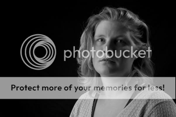
Too much shadow and too much middle gray.
JCleveland
TPF Noob!
- Joined
- Nov 1, 2007
- Messages
- 188
- Reaction score
- 0
- Location
- Saskatoon, Sk
- Can others edit my Photos
- Photos OK to edit
i agree with MaxBloom.. too much grey. I prefer this type of photo to have a little more contrast. White is white and black is black. I kind of like the whole idea of the left side of her face being quite dark.. I would just focus on your main\key light area of the face, brightening that up a wee bit.
- Joined
- Dec 16, 2003
- Messages
- 33,896
- Reaction score
- 1,853
- Location
- Edmonton
- Can others edit my Photos
- Photos NOT OK to edit
- Moderator 🛠️
- #5
With the main light so far off to the side and little or no fill...it's got a very artistic or edgy look to it...and as such, it's hard to offer critique. Either you pulled off what you were going for, or you didn't...but without knowing what you were trying to do...we don't know if you accomplished it or not. Do you know what I mean?
I like the hair light and the separation it give her from the background.
I agree that it could use a bit of 'pop'...whiter whites and more contrast.
I like the hair light and the separation it give her from the background.
I agree that it could use a bit of 'pop'...whiter whites and more contrast.
craig
TPF Noob!
If you are going for a dark look then you hit it. Dark is fine, but I think the shadow area is tough. I would at lest throw in a bounce card.
Love & Bass
Love & Bass
Similar threads
- Replies
- 7
- Views
- 324
- Replies
- 8
- Views
- 167


