C&C per req:
I'll assume that yours is a child photography website based on these images.
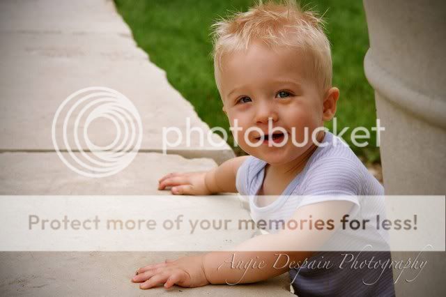
1. Nice capture, but the highlights are just a tad bright, especially given the light colour of his hair. I'd suggest down about 1/2 stop. The composition doesn't quite work for me in that the eye tends to follow the line of pilings right up and out the upper RH edge of the image.
2. Really nice, but the skin tones/WB seem just a bit warm to me. As well, the clipped hair is distracting.
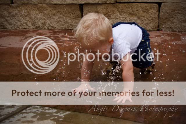
3. This one seems just slightly soft to me, but good exposure.
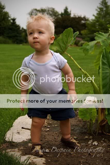
4. I really like this one; this would be my vote for your website picture, but if you can, I'd suggest a re-shoot and have him looking just a little more toward you; not directly at the camera, but with just a bit more face visible.
5. Another good capture, but he doesn't really look happy here; not what I'd suggest for advertising.
Just my $00.02 worth - your milage may vary
~John


")


![[No title]](/data/xfmg/thumbnail/32/32953-da4fe78e854d5dbe210d58591ccf42d4.jpg?1734162831)


