What's new

little constructive criticism here?

Islesfan91

TPF Noob!
Joined
Feb 27, 2014
Messages
43
Reaction score
18
Location
Richmond, BC
Can others edit my Photos
Photos OK to edit
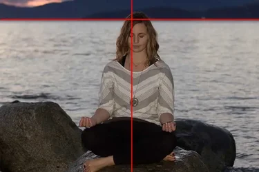
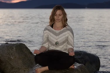
did my first photo shoot as a TFP with a new yoga instructor looking for photos to put together a website. I've got a ton of photos to go through and have only just started editing them, but I liked these two and wanted to see if there were any opinions on how to improve on them in post
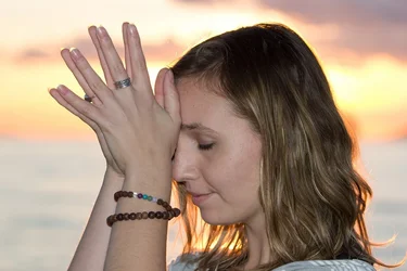
$13576111664_a6986dd5a8_b.webp

$13581499343_b065218495_b.webp


can't seem to get the pics to be a bit larger on the site here, maybe a moderator could adjust my failed attempts if possible

there are others I consider to be better photos but I haven't got to those yet, but would appreciate other opinions

thanks!
Tom
 
#1. Subject is too large in the frame, almost clipping her. The horizon is is too close to the top of the frame.Subject is center of frame. It's under-exposed for your subject. Step back, place subject slightly off to one side facing slightly into frame, put horizon a bit lower, say 1/3, expose for subject.

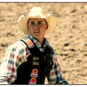
#2 is nice except you shot a tall subject horizontally. Try portrait orientation, again step back a little unless you like that crowded look.
 
gotcha, that helps a ton, first time working with someone taking photos for them so it was an interesting experience. The second photo was what she'd asked for, but I see what you're saying, and I'll keep it in mind for next time

Learning as I go, trial and a rather large pile of errors!

Will go back to the first in post and see if I can at least fix the exposure level
 
#1. Subject is too large in the frame, almost clipping her. The horizon is is too close to the top of the frame.Subject is center of frame. It's under-exposed for your subject. Step back, place subject slightly off to one side facing slightly into frame, put horizon a bit lower, say 1/3, expose for subject.

#2 is nice except you shot a tall subject horizontally. Try portrait orientation, again step back a little unless you like that crowded look.

Thats pretty much what id say.
 
gotcha, that helps a ton, first time working with someone taking photos for them so it was an interesting experience. The second photo was what she'd asked for, but I see what you're saying, and I'll keep it in mind for next time

Learning as I go, trial and a rather large pile of errors!

Will go back to the first in post and see if I can at least fix the exposure level

Also, ive found sometimes they think they know what they want and they will say thats what I asked for, but if you do what you think is right as a photographer and show them the difference they will often go "oh thats much better"
 
You should change your setting to allow your photos to be edited. I'd be happy to post an edit for you.
 
I can't speak to the technical aspects, but the top left corner in the first photo is very distracting. The bit where the hills dip down and you can see the sky. I think by pulling back like another poster suggested would help.
 
by the way, all this is greatly appreciated. Self taught leaves a lot of room for errors, advice and suggestions go a long way to helping me learn
 
In #1, besides the exposure issue, there is another problem here that isn't fixable in PPing, at least not easily.
She looks 'tilted' because you aren't square on to her and so that impacts the quietitude of the image.
(and you clipped her toe)

$13576111664_a6986dd5a8_blll.webp
 
definitely saw the toe was clipped off, which frustrated me, but she liked the photo anyway so I was trying to salvage it. I do agree the top left corner is distracting and that the angle is off, I'll see what I can do to fix both of those. I can't find an "add toe" option in lightroom 5 or perfect photo suite 8 so I'll have to just mark that one up as "don't do that again moron" and try to fix what i can ;)
 
In #1, besides the exposure issue, there is another problem here that isn't fixable in PPing, at least not easily.
She looks 'tilted' because you aren't square on to her and so that impacts the quietitude of the image.
(and you clipped her toe)

View attachment 70196

plus you cut off her toes when you left plenty of room above her head.
 
The first thing I noticed was her slouched posture.
She needs to straighten her spine, roll her shoulders back and lift her chin up.
Eye contact goes a long way too
 
#1 Should have been framed vertically
Needs more light
Model's pose not Yogic

#2 Should have been framed vertically
Light maybe too much
 

Create an account or login to comment

You must be a member in order to leave a comment

Create account

Create an account on our community. It's easy!

Log in

Already have an account? Log in here.

Back
Top Bottom