Looking for feedback on 3 pics.

tlamour

TPF Noob!
Joined
Nov 5, 2011
Messages
57
Reaction score
3
Location
Brooklyn, New York
Can others edit my Photos
Photos NOT OK to edit
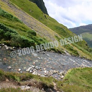
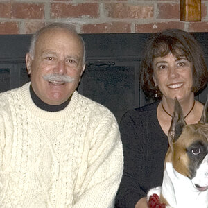
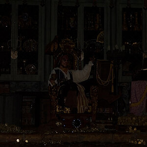
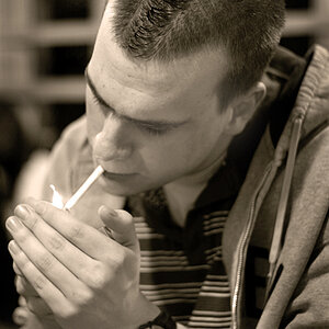
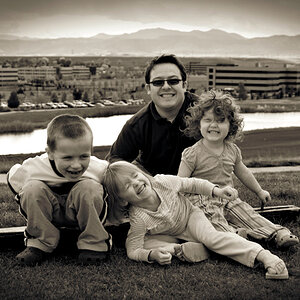
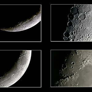
Hey. I'm pretty new to this site and just wanted some feedback on a few shots. I limited them to three. Any criticism is appreciated. As long as it's constructive. Thanks.


1)
0gicuVeM


2)
XCteBs2l


3)
jyTzuXtu
 
Last edited:
Okie Dokie, here we go....

#1 It's level!! Excellent start. Without the walker, it would just be another typical point-at-the-sunset shot. You added something extra, which I think.... adds something extra. However, your losing a lot of exposure that far to the edge of the frame so the silhouette doesn't contrast with the background as much as I would like. It's good that he's juxtaposed against the much brighter water, but it's still quite dark on that edge. The main subject (the walker in my opinion, not the sun) should pop! I think the best solution is to increase exposure. You'll lose more detail around the sun, but hey, it's the sun. It's bright.

I recommend considering a non-standard panorama crop on this. I think that will strengthen the relationship between the walker and the sun.

#2 Level ftw.

Again I think you are a little too underexposed for my taste. But that's not what is bothering me the most. What is bothering me the most is that foreground rock that you clipped off and now seems 'attached' to your black border. I realize this is probably the edge of the beach, but let the beach create a natural border. Those small rocks emerging from the water are critical for this shot, but they are framed like they were an after-thought.

#3 Technically, there is one thing I'd fault you here, and the solution to it may solve another issue which is not technical. Because the camera is pointed above the horizon, you have slight perspective distortion, most noticeable on the right edge. Because it's such a small amount, you can fix this in photoshop with little degredation.

But more to the impact of the image. What interests me is not the window (which is the brightest part of the scene), nor the people walking (which is the darkest part of the scene), but the reflections on the floor. I would like to see this shot wider and/or portrait aspect so I can see both the window, and the awsome reflections of the light and the motion-blurred people on the floor.

I do think you chose a great shutter speed here. The people are individuals, but at the same time, they're all moving and busy with someplace to go.... I like how all but one of them are not looking at the camera, and the one that is looking is dressed differently. Not just differently, but he's wearing a white shirt amongst a huge group wearing dark. He stands out, which is neat. Good luck or good planning? I just wish I could see those freaking awsome reflections!! :D
 
Check out some of the guidelines of visual image composition.

10 Top Photography Composition Rules | Photography Mad
Advanced Composition -- Part I

The runner leads the eye right out of the first photo. Consider adding a bit of fill light to make the runne more apparent and crop some off the top and bottom to make it conform more closely to the rule of thirds horizonytally and give it a panoramic feel as bazooka suggested.

The way you have composed #2 makes it virtually impossible to crop so the photo is more dynamic.

the last is the best but needs some local contrast adjsutment and selective sharpening.

You profile doesn't show any editing preferences - My Photos Are OK to Edit or My Photos Are NOT OK to Edit.
 
Last edited:
I think 1st a little underexposed...
 
bazooka said:
Okie Dokie, here we go....

#1 It's level!! Excellent start. Without the walker, it would just be another typical point-at-the-sunset shot. You added something extra, which I think.... adds something extra. However, your losing a lot of exposure that far to the edge of the frame so the silhouette doesn't contrast with the background as much as I would like. It's good that he's juxtaposed against the much brighter water, but it's still quite dark on that edge. The main subject (the walker in my opinion, not the sun) should pop! I think the best solution is to increase exposure. You'll lose more detail around the sun, but hey, it's the sun. It's bright.

I recommend considering a non-standard panorama crop on this. I think that will strengthen the relationship between the walker and the sun.

#2 Level ftw.

Again I think you are a little too underexposed for my taste. But that's not what is bothering me the most. What is bothering me the most is that foreground rock that you clipped off and now seems 'attached' to your black border. I realize this is probably the edge of the beach, but let the beach create a natural border. Those small rocks emerging from the water are critical for this shot, but they are framed like they were an after-thought.

#3 Technically, there is one thing I'd fault you here, and the solution to it may solve another issue which is not technical. Because the camera is pointed above the horizon, you have slight perspective distortion, most noticeable on the right edge. Because it's such a small amount, you can fix this in photoshop with little degredation.

But more to the impact of the image. What interests me is not the window (which is the brightest part of the scene), nor the people walking (which is the darkest part of the scene), but the reflections on the floor. I would like to see this shot wider and/or portrait aspect so I can see both the window, and the awsome reflections of the light and the motion-blurred people on the floor.

I do think you chose a great shutter speed here. The people are individuals, but at the same time, they're all moving and busy with someplace to go.... I like how all but one of them are not looking at the camera, and the one that is looking is dressed differently. Not just differently, but he's wearing a white shirt amongst a huge group wearing dark. He stands out, which is neat. Good luck or good planning? I just wish I could see those freaking awsome reflections!! :D

Thanks for your feedback bazooka. I agree with everything you stated. 1 and 2 are a little overexposed. I bracketed the shots but I chose the over exposed one ( I guess for the wrong reasons). You're right the rocks are critical for that shot. I should have included more of them. I regretted it the moment I viewed the image at home. Originally, I wanted to break the symmetry. But then realized how important they are. I have other shots where I achieved this but I still think they lack something, so I won't bother posting them.

As far as the 3rd shot goes, I waited about 10 min to get the shot. I timed what I could and a little luck helped. I noticed the perspective distortion but I had no idea it was due to me being above the horizon line. I've read a few books on photog and none of them mentions this rule. I will google it and see what I find. Once again, thanks!
 
KmH said:
Check out some of the guidelines of visual image composition.

10 Top Photography Composition Rules | Photography Mad
Advanced Composition -- Part I

The runner leads the eye right out of the first photo. Consider adding a bit of fill light to make the runne more apparent and crop some off the top and bottom to make it conform more closely to the rule of thirds horizonytally and give it a panoramic feel as bazooka suggested.

The way you have composed #2 makes it virtually impossible to crop so the photo is more dynamic.

the last is the best but needs some local contrast adjsutment and selective sharpening.

You profile doesn't show any editing preferences - My Photos Are OK to Edit or My Photos Are NOT OK to Edit.

Thanks for tips. To be all honest, my MacBook pro wasn't doing the job so I'm upgrading to an iMac. For now I've been editing on my iPad using Filterstorm. It's allows me to do basic stuff like saturation/WB correction/filters/etc. But once I get my iMac, I'll be able to edit these properly with y'all suggestions in mind. Thanks
I will edit my preferences. I'm alway open to one's perspective.
 

Most reactions

Back
Top