c_pass
TPF Noob!
- Joined
- Jul 13, 2011
- Messages
- 189
- Reaction score
- 4
- Location
- New Jersey
- Can others edit my Photos
- Photos OK to edit
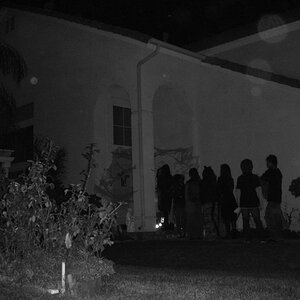
I took these at this 9/11 memorial in NJ...
Let me know any thoughts..
Image1

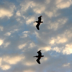
Image 2

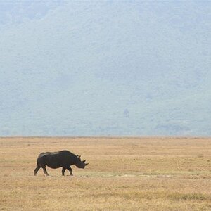
Image 3

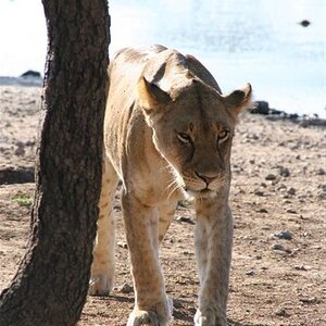
Image 4

Let me know any thoughts..
Image1
Image 2
Image 3
Image 4