msgbmd2001
TPF Noob!
- Joined
- Sep 14, 2012
- Messages
- 50
- Reaction score
- 5
- Can others edit my Photos
- Photos OK to edit
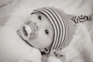
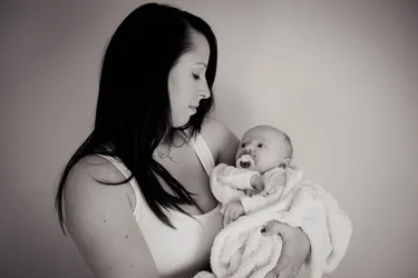
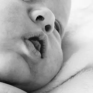
I took a few photos for a friend and her newborn son. Really wish he would have been happy without the pacifier in his mouth... but that wasn't happening.
Any C&C you guys can give me is greatly appreciated. Thanks!!
1.
2.
3.
Any C&C you guys can give me is greatly appreciated. Thanks!!
1.
2.
3.


![[No title]](/data/xfmg/thumbnail/30/30886-4d4f2b370f36c175a23901cc8689aea4.jpg?1734158893)

![[No title]](/data/xfmg/thumbnail/34/34685-17f2466cddc9890af6ca67c65e2e7d5c.jpg?1734165691)


![[No title]](/data/xfmg/thumbnail/36/36653-04eb462de8b26218114605cd5ed176cf.jpg?1734169166)
![[No title]](/data/xfmg/thumbnail/36/36654-55e621bd8f3203cdd106e3764c553c4d.jpg?1734169167)