What's new

Looking for some Cc

N1kon1k

No longer a newbie, moving up!
Joined
Dec 5, 2015
Messages
151
Reaction score
39
Can others edit my Photos
Photos OK to edit
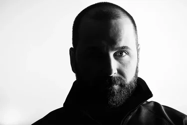
Playing around with lighting since I’m trying to grow in portraiture and wondering what you all think on this shot.
 

Attachments

  • 43221533-DCAE-4D26-A5A1-B21A0EAF3FE7.webp
    43221533-DCAE-4D26-A5A1-B21A0EAF3FE7.webp
    51.1 KB · Views: 138
I think we should be able to see the other side of the face, and when you have essentially a vertical subject, why not frame it vertically? Having the background go completely white is hardly necessary, and that much contrast is a distraction in itself.
 
I very seldom disagree with Designer but in this case I might deviate slightly, but first a question. What was your intent, because I can see a couple different ways you might have been going?

If you were attempting split lighting, I'm not a fan of the white background. It's a drama type set up that works better with dark and moody. Split lighting: create old Hollywood-style drama :: Digital Photo Secrets On the face you have a nice line on the nose dissecting the face cleanly but it appears that your key was to low, letting the shadow line creep right on the forehead, and as mentioned above having a little detail peeking through the shadows creates interest.

If your intent was high contrast then I prefer the almost posterization type look High-Contrast B&W With Lightroom with deep blacks, and a dark background.

Low Key or High Key are other possibilites. Understanding The Basics of High Key vs. Low Key Lighting | Contrastly High Key would work with the white background.

I'm not hooked on portrait or landscape mode, in this IMO either could work.
 
I am assuming that you were trying to do split lighting,and this is indeed split lighting with one side of the face highlighted, and the other side of the face in full shadow. I have never really been fond of this type of lighting, but you have achieved it here.

I think it would have looked better framed as a vertical, so as to give him a little bit more top space as it is called, above his head, which comes very close to the top edge of the frame.

I really do not have much C&C to give you. You have achieved a very high contrast, split lighted, horizontally framed portrait. It is what it is.

 
Last edited:
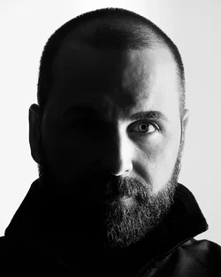
I do have it in a different crop, my goal was to play around with split lighting as @Derrel mentioned but also give a mix of high key with as @smoke665 also mentioned... I was trying to pull as many highlights possible and crashing shadows without losing detail as much as possible to try something different.. here is a different crop that was originally done
 

Attachments

  • 3A74134C-F3BC-47BD-9024-A0C207E88E3B.webp
    3A74134C-F3BC-47BD-9024-A0C207E88E3B.webp
    101.6 KB · Views: 111
I was trying to pull as many highlights possible and crashing shadows without losing detail as much as possible to try something different.. here is a different crop that was originally done

I'm afraid you might have missed the mark some on this. While the highlight side reflects good detail, the shadows have little to none, except at the back of the head where you caught some reflected light off the background. Looking at the image again based on highlight in the eye the center of the light appears at or even below the center line of the eye. Raising it slightly would allieviate the shadow creep on the forehead. Adding a small reflector on the shadow side should allow you to move just enough light to bring in limited details, in the eye.

I know I'm in the minority here, but I'm not a fan of the portrait crop on this image. There isn't enough headroom on the image regardless of the orientation.
 
.. but also give a mix of high key ..
Since trying high key didn't work out so well, why not give it another try in low key?

Frankly, the most successful high key portraits we see are made with blonde females wearing white. You have an inherently good head start (see what I did there?) for a low key portrait.

Let the BG go to black, get the exposure right on the key side, and use a reflector on the off side. Low key is just as demanding as high key, just different.
 
Playing around with lighting since I’m trying to grow in portraiture and wondering what you all think on this shot.

For me, low key means black, a lot of black. A black or dark gray background works much better to achieve a certain atmosphere with this type of lighting, make the distance between model and background reasonably large and don't use lights on the background. Ensure correct exposure with the illuminated side of the model. In the way I learned it 40+ years ago, I don't really like a gray part of the face with poor details, but prefer a very dark/black part of the face instead. Dark shadows and black really make low key photography. I think the gray part of the face, as shown in your photo, undermines the power this type of lighting ought to radiate, but of course that's entirely my personal taste. The accompanying edit is only a quick example. I would like to point out that a horizontal framing for portraiture rarely works or rarely has a function, so use a vertical or even square framing. For me it's nice if the separation between light and dark runs across the nose. You're already well on your way, I think it's fairly easy for you to achieve a perfect end result with the given tips and information!

View attachment 180935
 
Note that I said the picture would possibly have been better had it been framed as a vertical. This means at the time of shooting. There is a big difference between framing and cropping, a big difference between composing and cropping. Your vertical version of this photo is just a crop, and suffers from the same lack of headspace. You have a big head filling the frame, with a subject looking like he has been stuffed into a small rectangle. When you work with a camera that shoots in a 3 to 2 ratio as do the majority of current digital single-lens reflex models, you must account for the frame's proportion when composing your shots. In my original commentary I said this picture might have been better if it had been framed as a vertical, not cropped to Vertical from an originally horizontal composition. I do not think the crop is any better than the original and is actually worse than the original.
 
Really appreciate everyone’s input and thought process, will dive into this shot again with everyone’s input and see how it will come out... I’m sure I will than be able to see more clearly the difference and how much stronger of an image it will be. Once again thanks to all who pitched in
 
What he said ^^^^^. However sometimes when you get lemons you make lemonade. If you don't have sufficient headroom, sometimes it's better to crop so it looks intentional. Changed your crop to a 4:3 and made a few modifications in Lr.

43221533-DCAE-4D26-A5A1-B21A0EAF3FE7.webp
 
Does your camera offer in-camera cropping to possibly a 5:4 aspect ratio? Some cameras offer multiple aspect ratios, with through the viewfinder image masking. Many people find the 3 to 2 aspect ratio somewhat difficult to work with when doing Tall photos.
 
Really appreciate everyone’s input and thought process, will dive into this shot again with everyone’s input and see how it will come out... I’m sure I will than be able to see more clearly the difference and how much stronger of an image it will be. Once again thanks to all who pitched in
As long as you're going to keep at it, may I suggest some different poses as well? Your full-on face portrait is but one possibility, and it has its uses, for sure, but I'm thinking if you experiment with some different poses, you can see what I'm talking about. Take a few minutes to check out some low key portraits online for inspiration.
 
@smoke665 thanks for the additional tip, I do like the feel and how the light drops of in the negative space, a lot better than the high key concept I was going for, the more I look at the image the more I see what you all mean...

@Derrel yes I do have the ability and I should start thinking that way as well, you’re right Derrel I do tend to struggle with the 3:2
 
do like the feel and how the light drops of in the negative space, a lot better than the high key concept I was going for, the more I look at the image the more I see what you all mean...

Typically I associate High Key with light and airy, you still have shadow detail but less defined, less dark. Low Key is the opposite, dark and moody, with deep shadows. Here's a High Key I did for practice awhile back as a study of white on white, that illustrates the effect.
2019-10-20_11-03-06.webp
 

Create an account or login to comment

You must be a member in order to leave a comment

Create account

Create an account on our community. It's easy!

Log in

Already have an account? Log in here.

New Topics

Back
Top Bottom