these aren't pictures of anything specific just 6 random snaps so the critique would be useless because the camera did all the work.
Set out to take a picture of some specific thing, compose and expose and then post one or two.
I respectfully disagree. Yes, once the OP has advanced enough to be attacking a specific problem, posting one or two in a relevant gallery will get the most constructive feedback. However, from these six images (an appropriately sized share, I think), I can tell that:
- The OP either likes or is experimenting with shallow depth of field as a means of isolating the subject.
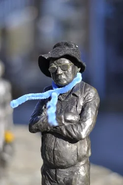
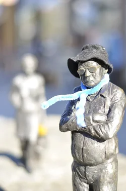
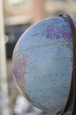
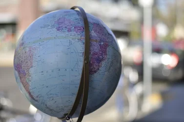
To which I would say, maybe you're shooting too wide open. You want your depth of field to include all of your subject. For example, on the picture of the male statue, the out-of-focus "scarf" is distracting, I would have made that more in focus (maybe not razor sharp, but much less fuzzy). Remember that you can alter depth of field by your aperture but also by your distance from the objects, so you can experiment with getting your subject in focus while keeping the background items blurred. Also, note that I said "subject" and not "object". In the shots of the globe, I assume that you intended for the globe to be your subject. However, you could also have turned the globe to show Europe and Africa, for example, then used a shallow depth of field to just have Europe sharp, if "Europe" and not "the globe" is your subject.
- The OP is willing to experiment with composition. I see three different shots involving the two statues, and two different shots with the globe. This is a good thing. Many (most?) people would take one photo of the statues, or of the globe, and call it a day. From this selection I can offer that:
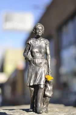
--While there are things I like about the two solo statue images, the centered composition doesn't do much for the images. The third shot, with the sharp male off center and the out of focus female in the background, is a much more interesting shot. I like how it is cropped through his legs while getting all of her in the shot. I personally would have gotten her more in focus (not nearly sharp, but enough that she is more identifiable) - that would tell me the story that you shot a portrait of him while he is waiting impatiently for her to come along.
--The shot of the globe in portrait orientation does nothing for me - the vertical orientation doesn't seem to fit, and the crop through the globe is awkward. The shot in landscape orientation, showing the entire globe (and off-center to boot) is a strong composition.
- The OP is shooting in manual (so the camera is not just doing all the work), and though there was some "tinkering" with the exposure scale it seems to me like one area for the OP to work on is understanding how the camera calculates exposure. The globe is underexposed, but with the bright background I suspect that the camera's exposure meter was showing a proper exposure. The two solo statues are pretty close to properly exposed but the shot of the pair is well overexposed - because the OP didn't recheck exposure settings after the previous shots?
Throw up 20 shots across landscapes, still lifes, portraits, and what have you and yes, that is too cumbersome a photo dump for a useful critique. Give me 5-6 in a few groups like this and I think that is more helpful to discern trends, either good or bad, in a noob's work. Give me just one of these images and I likely would not have as much useful (I hope) input.



![[No title]](/data/xfmg/thumbnail/37/37602-1ef8dbb1c2d0e4ff347ee65d328c3603.jpg?1734170730)

![[No title]](/data/xfmg/thumbnail/40/40304-a0ff25efbc1737761e8c4d43e2caa085.jpg?1734174712)
![[No title]](/data/xfmg/thumbnail/37/37605-90c8efaef5b7d1f52d4bf8e7dfd33673.jpg?1734170732)

![[No title]](/data/xfmg/thumbnail/35/35264-5ade32b7036391926536661aeb7491c3.jpg?1734166921)