

ematic
TPF Noob!
- Joined
- Feb 12, 2011
- Messages
- 32
- Reaction score
- 1
- Location
- Great White North
- Can others edit my Photos
- Photos NOT OK to edit
Hey folks, I don't post often, mainly because...well I don't know! I guess I don't like being on the computer too much!
Anyway, just thought maybe someone can give me any feedback on this image. I was trying to mimic those luxury magazine ad type photos, except I wanted to add some spice to it...so I have it a military feel with the brass casings as a backdrop.
I AM aware that the watch get's lost amongst the casings, but that was the idea. I did not want super clearly defined lines and too much contrast. Just enough that you can tell there is a black watch there, amongst the sea of brass/gold.
I tried to angle the face just right so no light would reflect off the glass, and just leave a clean black surface. The shot was taken using 3 speedlights and some homemade softboxes/diffusers. (I like to build my own gear )
)
I should note that this was my first time ever doing a properly setup ad style photo, and only my second time using OCF.
Anyway, let me know what you think. I am actually very happy with how it came out (after many shots and repositions of the lights etc). I am more curious to know what the pros think! (the only I could wish for is super shiny, scuff free brass, but I deal with what I have at home!)
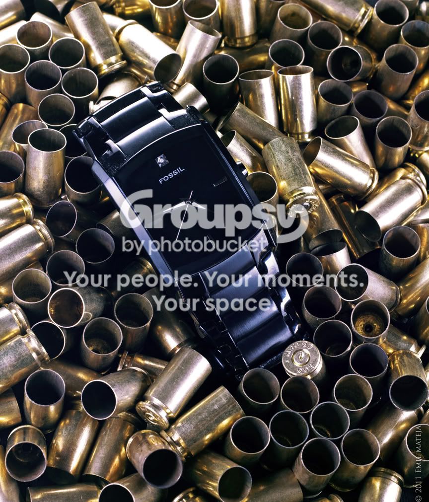
Anyway, just thought maybe someone can give me any feedback on this image. I was trying to mimic those luxury magazine ad type photos, except I wanted to add some spice to it...so I have it a military feel with the brass casings as a backdrop.
I AM aware that the watch get's lost amongst the casings, but that was the idea. I did not want super clearly defined lines and too much contrast. Just enough that you can tell there is a black watch there, amongst the sea of brass/gold.
I tried to angle the face just right so no light would reflect off the glass, and just leave a clean black surface. The shot was taken using 3 speedlights and some homemade softboxes/diffusers. (I like to build my own gear
) I should note that this was my first time ever doing a properly setup ad style photo, and only my second time using OCF.
Anyway, let me know what you think. I am actually very happy with how it came out (after many shots and repositions of the lights etc). I am more curious to know what the pros think!
(the only I could wish for is super shiny, scuff free brass, but I deal with what I have at home!)
Last edited:


![[No title]](/data/xfmg/thumbnail/37/37245-5f15b292311b21913f10cc41f40682ba.jpg?1734170036)
![[No title]](/data/xfmg/thumbnail/34/34069-7b423c5bb5d324f4d924cf839cc122b3.jpg?1734164502)
![[No title]](/data/xfmg/thumbnail/39/39473-02c5070f4f13c145d9e4e3f13d9eec0f.jpg?1734173566)
![[No title]](/data/xfmg/thumbnail/34/34071-9d82cc63ea930e951f24480c250e35d1.jpg?1734164507)
![[No title]](/data/xfmg/thumbnail/37/37606-3c9ffb5906173fa2aa489341967e1468.jpg?1734170733)