jcdeboever
Been spending a lot of time on here!
- Joined
- Sep 5, 2015
- Messages
- 19,868
- Reaction score
- 16,081
- Location
- Michigan
- Can others edit my Photos
- Photos OK to edit
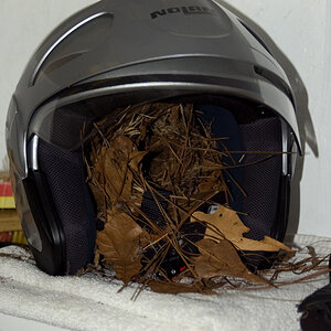
Shot on my cell phone.
1

2

3

4

5

Sent from my XT1254 using Tapatalk
1
2
3
4
5
Sent from my XT1254 using Tapatalk