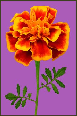
Marigold on Purple - 6th in the Pop Floral Series

Center crop of Marigold

$Marigold-crop.jpg
 
I think you should rethink your choices of the couple images done on white backgrounds, in view of this as a series.
The white background looses the edge most of these have. They lose the intensity. They look like product shots. They step away from the pop art feel of the rest of them.
 
I think you should rethink your choices of the couple images done on white backgrounds, in view of this as a series.
The white background looses the edge most of these have. They lose the intensity. They look like product shots. They step away from the pop art feel of the rest of them.

I agree... and I do have some others done. The rose... I don't consider that pop art material anyway... shot that for fun. The rest can be with good color in the background! I still have 3 or 4 more flowers I definitely want to shoot... do you have any suggestions?
 
That picture sucks. It looks totally fake...
Troll.

I don't understand. According to what I read from you and some other large thinkers in another thread, this is exactly the type of critique which you believe is appropriate.

But, okaaaaaaay... Allow me to sugarcoat it:

It's not a good picture. There's nothing about the image which looks like an actual flower. The colors are unnatural. They image is entirely over-saturated. It looks more like something someone made out of colorful construction paper. Now, if that was the goal, kudos; mission accomplished.

Something tells me it wasn't, though...
 
Quite a departure from trad photography, Charlie...but as a piece of art...I think it is very, very interesting. Yes, very "pop-artsy"... I'd put that on my wall in a second. My OCD side tells me to crop a tiny, tiny bit of the right edge...maybe a little off-balance....yep, I just checked again. But the logo adds to the "weight" on that side...if you plan on keeping it there ;) Very cool theme...I see you have others, I'll have to hunt em down and check em out.
 
Considering the series to which this is meant to be part of, make and background and "fake-ness" of flower don't matter - but to my mind the colour of the background really clashes with the colours of the flower. Yes, it may "clash" and be all opposite, for example, but I feel that purple and orange are ... ugh. But I may be an exception.
 
Quite a departure from trad photography, Charlie...but as a piece of art...I think it is very, very interesting. Yes, very "pop-artsy"... I'd put that on my wall in a second. My OCD side tells me to crop a tiny, tiny bit of the right edge...maybe a little off-balance....yep, I just checked again. But the logo adds to the "weight" on that side...if you plan on keeping it there ;) Very cool theme...I see you have others, I'll have to hunt em down and check em out.

Hey Charlie... Appreciate that! It is meant to look like that .. POP ART, right! lol! (as you and most others pick up on... apparently some people know nothing about art! ;) ) I centered these by eye... instead of measuring, so it is probably off a hair. I will check that! Thanks for the comments.. very much appreciated! :)
 
Considering the series to which this is meant to be part of, make and background and "fake-ness" of flower don't matter - but to my mind the colour of the background really clashes with the colours of the flower. Yes, it may "clash" and be all opposite, for example, but I feel that purple and orange are ... ugh. But I may be an exception.

LaFoto, thank you for that comments! I was trying to "Complimentary colors" per the color wheel... and yellow and purple are that! Please suggest a color you would like... I am very willing to try it! :)

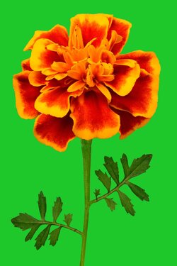
Possibly a green

$Marigold-yellow-green-background.jpg

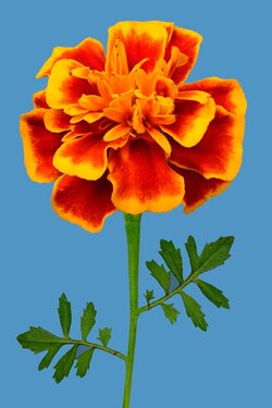
or blue-green to compliment the reds and red-oranges?

$Marigold-blue-green-background.jpg
 
Considering the series to which this is meant to be part of, make and background and "fake-ness" of flower don't matter - but to my mind the colour of the background really clashes with the colours of the flower. Yes, it may "clash" and be all opposite, for example, but I feel that purple and orange are ... ugh. But I may be an exception.

I gotta agree on this one. The purple is just SO overpowering on this one. Did you try any other background colors? I've liked the "pop art" feel of the colors on this others, but this one is just SO strong and "clashing" that I'm not sure. I do like the flower part, just not sure about the background.
On the other hand--I find myself wondering how it will look when combined with some of the others. Maybe the purple/orange combination would fall into place better when grouped with the others.
 
Considering the series to which this is meant to be part of, make and background and "fake-ness" of flower don't matter - but to my mind the colour of the background really clashes with the colours of the flower. Yes, it may "clash" and be all opposite, for example, but I feel that purple and orange are ... ugh. But I may be an exception.

LaFoto, thank you for that comments! I was trying to "Complimentary colors" per the color wheel... and yellow and purple are that! Please suggest a color you would like... I am very willing to try it! :)

Possibly a green


or blue-green to compliment the reds and red-oranges?

So, evidently you posted options while I was typing my dithering response! :D

I like either of these better than the purple. TO ME, the problem is that the yellow is already overpowered by the orange in the flower, so the complementary color that I would pick would fall more into the blues than the purples.

EDIT: After looking again, I like the blue, but it's losing a little of the "pop art" feel...but a little more "vibrance" to the blue?
 
Considering the series to which this is meant to be part of, make and background and "fake-ness" of flower don't matter - but to my mind the colour of the background really clashes with the colours of the flower. Yes, it may "clash" and be all opposite, for example, but I feel that purple and orange are ... ugh. But I may be an exception.

I gotta agree on this one. The purple is just SO overpowering on this one. Did you try any other background colors? I've liked the "pop art" feel of the colors on this others, but this one is just SO strong and "clashing" that I'm not sure. I do like the flower part, just not sure about the background.
On the other hand--I find myself wondering how it will look when combined with some of the others. Maybe the purple/orange combination would fall into place better when grouped with the others.

Maybe a lighter purple? Trying to stay with vibrant colors as part of the theme.

$Marigold-light-purple.jpg
 
Last edited:

Most reactions

New Topics

Back
Top