Marigold on Purple - 6th in the Pop Floral Series

Considering the series to which this is meant to be part of, make and background and "fake-ness" of flower don't matter - but to my mind the colour of the background really clashes with the colours of the flower. Yes, it may "clash" and be all opposite, for example, but I feel that purple and orange are ... ugh. But I may be an exception.

I gotta agree on this one. The purple is just SO overpowering on this one. Did you try any other background colors? I've liked the "pop art" feel of the colors on this others, but this one is just SO strong and "clashing" that I'm not sure. I do like the flower part, just not sure about the background.
On the other hand--I find myself wondering how it will look when combined with some of the others. Maybe the purple/orange combination would fall into place better when grouped with the others.

Maybe a lighter purple? Trying to stay with vibrant colors as part of the theme.

View attachment 15128

I like that a LOT better than the first purple. But you might wanna fix those little dark bits in between the leaves... ;)

What dark parts? ;) (shouldn't get in a hurry! lol!)
 
Yes, the lighter purple is a lot easier on the eyes.
As to the other suggested background colours, I like the green and feel it works really well (as that colour once again "pops" and is not as muted as the lighter purple), but I don't know if green might already be "gone"?
 
cgipson1 said:
Maybe a lighter purple? Trying to stay with vibrant colors as part of the theme.

<img src="http://www.thephotoforum.com/forum/attachment.php?attachmentid=15133"/>

I like all the backgrounds but purple the most. Orange and purple aren't colors you normally see together and I like that. The green and blue backgrounds look nice as well but they don't have the same feel as the purple! Purple is also my favorite color so I might be a little biased here!
 
cgipson1 said:
Maybe a lighter purple? Trying to stay with vibrant colors as part of the theme.

<img src="http://www.thephotoforum.com/forum/attachments/nature-wildlife/15133-marigold-purple-6th-pop-floral-series-marigold-light-purple.jpg"/>

I like all the backgrounds but purple the most. Orange and purple aren't colors you normally see together and I like that. The green and blue backgrounds look nice as well but they don't have the same feel as the purple! Purple is also my favorite color so I might be a little biased here!

hahaha... I am glad you like the purple! it is definitely a noticeable combination! :)
 
Yes, the lighter purple is a lot easier on the eyes.
As to the other suggested background colours, I like the green and feel it works really well (as that colour once again "pops" and is not as muted as the lighter purple), but I don't know if green might already be "gone"?

Nothing is set in stone yet... and there are so many different shades of each color, unlimited possibilities! I like the green also... :)
 
I wanted to add that I agree with Bitter about the white backgrounds.
 
these look like some pictures you would see in a kids coloring book about flowers ..on your blue edited background you missed a few spots:lol: take a closer look between the leaves.
 
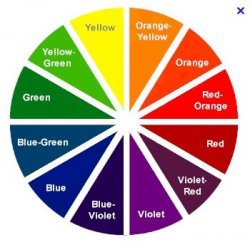
Well, you have done it again - presented a very interesting flower picture, interesting in that it has generated a lot of discussion - which is a good thing. I think part of it, as you have indicated, is that you were going for complimentary colours yellow and purple, but the flower isn't really yellow, it is more orange and red contrasting with the purple and these aren't complimentary colours which is why the one you have on the "blue" looks a lot better in the sense that there isn't the contrast or clash of colour in this image as these are more complimentary than the purple/red-orange combination. Regardless, I await your next offering.

WesternGuy

P.S. For those that are interested, do a Google search on "colour wheel" or "color wheel" - you might be intrigued by what you get.
 
these look like some pictures you would see in a kids coloring book about flowers ..on your blue edited background you missed a few spots:lol: take a closer look between the leaves.
These are not the images I send for prints! I admit I didn't proof some of the early ones well before posting them here. But at this size.. it didn't really matter.
 
I actually like it. It looks artistic which is what you were going for. I do prefer the blue background better.
 
I actually like it. It looks artistic which is what you were going for. I do prefer the blue background better.

Thank you! I appreciate it!
 
Well, you have done it again - presented a very interesting flower picture, interesting in that it has generated a lot of discussion - which is a good thing. I think part of it, as you have indicated, is that you were going for complimentary colours yellow and purple, but the flower isn't really yellow, it is more orange and red contrasting with the purple and these aren't complimentary colours which is why the one you have on the "blue" looks a lot better in the sense that there isn't the contrast or clash of colour in this image as these are more complimentary than the purple/red-orange combination. Regardless, I await your next offering.

WesternGuy

P.S. For those that are interested, do a Google search on "colour wheel" or "color wheel" - you might be intrigued by what you get.

I have been playing with colors.. complimentary, close and non, trying to see what is best accepted. Some interesting results! lol! Thank You!!! :)

$Color wheel.JPG
Color wheel as you mentioned..... lol!
 

Most reactions

Back
Top