Sweet work. The colors are nice but it's the silhouette and reflection that make this a memorable shot. Well done by you.
A couple of hints. I think I like the shot with more of the sky. I get the temptation to center the horizon b/c it's not as if the sky or the reflection is significantly better over the other--they're both attractive in their own rights. And, as for photographic composition rules, as that great photographer and pirate Captain Barbosa once said "they're more like guidelines really." But when I look at the original, my eyes are drawn to the horizon and they go left and right (not up and down). Also, I'd make two small edits. Erase that rock or footprint off to your left--it's distracting. And I do think I'd follow the hint and remove the refinery on the right side of the horizon.
But even as is, it's a beautiful shot that would be appropriate hanging in any house or office space. Well done.



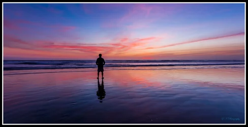


 I agree with BrickHouse that I'm a little distracted by the oil platform in the background, maybe it's an irony thing - natural beauty being overlooked by a dirty great oil rig!? Haha.


![[No title]](/data/xfmg/thumbnail/39/39185-29433e4f46e4b0bd394d10962886594c.jpg?1734173059)
![[No title]](/data/xfmg/thumbnail/37/37602-1ef8dbb1c2d0e4ff347ee65d328c3603.jpg?1734170730)
![[No title]](/data/xfmg/thumbnail/41/41937-bd46d08f9adcefe8bc65477f19a4f580.jpg?1734176290)


![[No title]](/data/xfmg/thumbnail/39/39186-88f5235eacfd57deab14674ccf8e7f0a.jpg?1734173061)