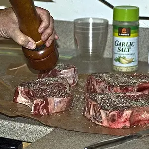
Not a huge fan of his hand placement in 2 and 3. There's something about it that's just off in my eyes.
Typically, I'm not a fan of selective coloring, and this is one of those times. I feel like the wrong things were colored. I wonder why you chose what you did. More insight would be awesome. Alternatively, it can work at times.
The first one is golden. I love that it's very organic--it's got great earthy tones, her dress isn't competing with her smile, and the rocker and teddy are a wonderful piece. It's got good depth of field, and I think it's pure gold.
I didn't care for the last two. Not because I feel like their bad photographs, but I feel like there's too much of the shrub, and not enough on the girl. More of her face in the frame, and less of the dress, less of the bush, and a similar depth of field would make both of them better, to my eye.





![[No title]](/data/xfmg/thumbnail/37/37127-bf1c0cde30f216dbd2804a0e700d6433.jpg?1734169834)