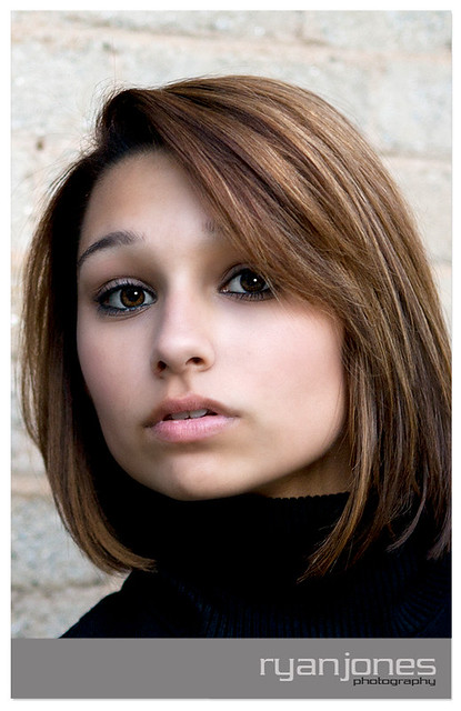
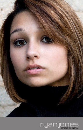
I think more space at the bottom of the frame is needed...her eyes seem a bit too high in the frame...the composition just does not feel right...with all of that light-colored masonry wall behind her, that "advances" and the dark "recedes" (a design principle that one cannot alter), and the black sweater she has, and then that big gray band across the bottom...all together the gray-black-light tonalities are making this unsuccessful as-shown. I think with more of her dark sweater at the bottom as a visual anchor, that it would be better. It looks as if her skin has been softened quite a bit in post...maybe more than is needed, but you're on the right track...the skin looks very 2010-ish, the way it's been PP'd.