What's new

mild C&C request

astroNikon

'ya all Bananas I tell 'ya
Joined
Aug 15, 2013
Messages
13,698
Reaction score
3,373
Location
SE Michigan
Can others edit my Photos
Photos OK to edit
I'm trying to be more artsy - or trying to take photos that people would enjoy looking at, rather than just a snapshot.

So with the December Santa photo thing I went on a quest to try and improve my photo taking (again) :)

I've also learned a few things in Lightroom above the really basic stuff (exposure & straighten the photo) such as B&W, perspective, contrast, collors :)

So up for your consideration are some pictures, not of "rocks at rest" but of other things that I enjoyed taking a photo of and trying to adjust things. So provide your comments and I'll try to improve the photo or adjust it yourself and tell me what you did.

I also have a nice bird picture of a swan flying *away* from me :(

Thanks

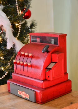
# 1 - okay, it's a vintage cash register
$TPF02.webp

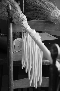
# 2 - tried some leading lines to the heart box
$TPF03a.webp

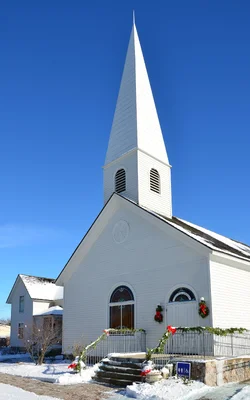
# 3 church but contrast of the sky, sunlight white sides, with white shadows, and some vertical perspective control
$TPF04.webp

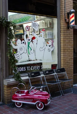
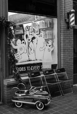
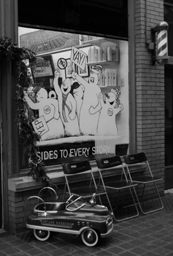
# 4 - Christmas firetruck at the Barbers
$TPF05.webp

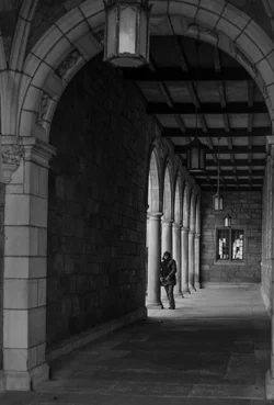
# 5 - B&W - I like it, not sure what to say
$TPF06.webp

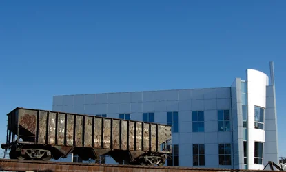
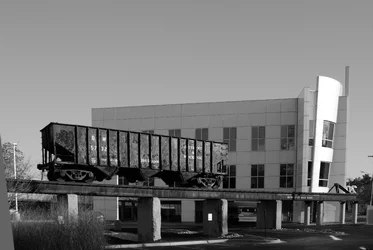
# 6 - Old meets New - yes that building has some interesting non-vertical lines.
$TPF07.webp
 
well I got two pieces of feedback so far

1 - from the Musée Marmottan Museum in France. They want me to print these on canvas, frame them and then they were going to replace some old dude's pictures named Monet with them

and
2 - The Waste Management company offered me a free electronic trashcan in which when I import into Lightroom it automatically goes into the trashcan.

I'm not sure which to take :(

hey, do I have to cut off my ear like that one dude ? or was that someone else ?
:scratch:
 
I am not sure what mild feedback is so I will be exceptionally harsh instead.

#5 is the only one I like. Has a bit of a tilt and having the subject looking at the camera smiling makes it seem a bit less arty.
 
I'd have to agree with runnah a little bit, but I also think that there is potential with the pedal car. Maybe different angles, just the car, not sure but it could be a good one.
 
I like #4 and 5. I didn't look at #5 larger so I couldn't see that the woman was smiling at the camera, but I don't know that it harms the photo. It does introduce an ambiguity - does the woman know her photo is being taken and she's sort of modeling, or did she catch you in the act? I say leave that up to the viewer.

The others I would say would have benefitted from different angles. The cash register lends itself to a close-up, shallow dof detail shot, I think. The church? Maybe low angle below the steeple - go minimalist with angles and white building against blue sky. And the leading lines to the heart box - I like the idea and it would have worked better with less clutter around it.
 
The cash register falls into the category of "interesting object, just dumped into the middle of the frame". The lesson here is that an interesting Thing does not always make an interesting Picture.

The brooms(?) and heart box is a great idea. You're starting to see the Picture instead of the Thing here. The trouble is that the most visually interesting this in the mass of white whateveritis dangling bang in the middle of the frame. The thing YOU saw is the heart box, and it's lost, tonally. No contrast there, not even any light or dark tones. The lesson here is that just because YOU see the composition doesn't mean WE will. You have to really hit us on the head, and avoid distracting us, to make US see it.

Church has too much crap in the bottom third. Is this an austere geometrical study, or a picture of a local church? Pick one, and do that. I think you could drop this to the steeple+sky and make something quite a bit stronger.

I like the fire truck. I'd pump up the whites a bit, especially on the barber pole, so you get a little diagonal interplay between the truck and the barber pole.

#5 everyone always likes this picture, which is why there are 1928293829082 instances of it already. I hate it, for just that reason. Also, a bit on the flat side, tonally.

#6 is a good idea, but the execution is rotten. The train car is visually lost against the building, they almost blend texturally, and there's a bunch of stuff in the frame that doesn't need to be there. Are the two objects more clearly separated in color? Can you crop this down to the essentials of your idea?
 
All of that makes sense guys and gals, though I didn't know # 5 was smiling LOL

the cash register is just that .. a cash register. I guess a nice picture and that's about it.
#2 - I saw the heart box but couldn't do anything - this was at a kids museum field trip and the white blobs were hand made candles drying. I thought it was interesting, but you are right ... I saw it and understood the context of everything around. nothing really explains that.
# 3 - bingo. I understand that now. But I don't think that photo would help cropping it up. I have other more interesting church steeples which would make a more interesting photo. Though I do like the direct contrast of the sunlight white, shadow white, and the sky in this one.
# 4 - I'm going to push the whites a bit and report later tonight. But after i looked at it more the subject of the photo is unknown .. the car .. the barber pole, the window.
# 6 - I'll try cropping it alot & color ... and see what happens

Thanks everyone :)
 
Don't get obsessed with "subject". The idea that every picture should have one is silly and wrong.

Photographers tend to get locked into the unhealthy mindset that there is: the thing I am taking a picture or, and all that other stuff which I have to put up with.

Thinking of the Whole Frame is healthier and more productive!
 
Don't get obsessed with "subject". The idea that every picture should have one is silly and wrong.

Photographers tend to get locked into the unhealthy mindset that there is: the thing I am taking a picture or, and all that other stuff which I have to put up with.

Thinking of the Whole Frame is healthier and more productive!

Agreed. The 'subject' of #4 is the juxtaposition of all the elements in the frame. Don't worry about which element is supposed to be noticed first. It's an ensemble cast, not a star with supporting cast sort of a movie :)
 
Don't get obsessed with "subject". The idea that every picture should have one is silly and wrong.

Photographers tend to get locked into the unhealthy mindset that there is: the thing I am taking a picture or, and all that other stuff which I have to put up with.

Thinking of the Whole Frame is healthier and more productive!

Agreed. The 'subject' of #4 is the juxtaposition of all the elements in the frame. Don't worry about which element is supposed to be noticed first. It's an ensemble cast, not a star with supporting cast sort of a movie :)


Thanks. The photo actually was larger than that. I cropped out the door to the left and quite a bit off the top. I thought the 3 items were interesting. I've only started experimenting with B&W ... so maybe compare it to the color one.

I was going to go back and retake it lower to the ground too, but being 20 degrees Fahrenheit and I was warm in a car looking over the photos, the idea slipped away.
 
Updates on the photos


upped the whites, and shadows - B&W and Color
I like the color one better. The barber shop pole and fire truck car are more prominent. I just wish the green from inside the shop wasn't there (though it is of the Michigan Stadium). This might be more interesting with Selective Color with the Car and pole being in color.
$TPF04d.webp$TPF04c.webp


Cropped alot more and changed back to color for contrast of the train to the building
$TPF06c.webp
 
I'd think that you have the technical stuff down pretty well, so no point in talking about that. At this point, perhaps a different approach may be useful. Instead of trying to force a picture into being, take a step back and see the images without your camera getting in the way. Ask yourself what caught your attention and made it note-worthy, then think how to communicate that aspect. As for foreground and background, it's like wrapping paper - either it contributes, or it detracts. So there the decision becomes how much of it do you want to include, and how distinct do you need it to be to enhance your primary subject? You can try the photographic diet I'm currently on - to simplify the image and have it communicate one particular aspect. To some extent, image-making is about creating a story, and we need to think about which elements we need to include to make the story obvious to a viewer.
 
The cash register falls into the category of "interesting object, just dumped into the middle of the frame". The lesson here is that an interesting Thing does not always make an interesting Picture.

The brooms(?) and heart box is a great idea. You're starting to see the Picture instead of the Thing here. The trouble is that the most visually interesting this in the mass of white whateveritis dangling bang in the middle of the frame. The thing YOU saw is the heart box, and it's lost, tonally. No contrast there, not even any light or dark tones. The lesson here is that just because YOU see the composition doesn't mean WE will. You have to really hit us on the head, and avoid distracting us, to make US see it.

Church has too much crap in the bottom third. Is this an austere geometrical study, or a picture of a local church? Pick one, and do that. I think you could drop this to the steeple+sky and make something quite a bit stronger.

I like the fire truck. I'd pump up the whites a bit, especially on the barber pole, so you get a little diagonal interplay between the truck and the barber pole.

#5 everyone always likes this picture, which is why there are 1928293829082 instances of it already. I hate it, for just that reason. Also, a bit on the flat side, tonally.

#6 is a good idea, but the execution is rotten. The train car is visually lost against the building, they almost blend texturally, and there's a bunch of stuff in the frame that doesn't need to be there. Are the two objects more clearly separated in color? Can you crop this down to the essentials of your idea?

Don't get obsessed with "subject". The idea that every picture should have one is silly and wrong.

Photographers tend to get locked into the unhealthy mindset that there is: the thing I am taking a picture or, and all that other stuff which I have to put up with.

Thinking of the Whole Frame is healthier and more productive!

I don't have anything more to say ... than to say that THIS is exactly what I would have said... only far less eloquently.
 
I like that crop on #6. now the old meets new conflict is more apparent.
 
All great advice.

I have found myself "slowing" down when taking pictures. Last year it was basically "ooh cool, <snap> <snap>", learning what all those features were on the d7000, and how to get clear and sharp photos in manual mode (no post processing at that time).

This year I've been trying to get a better perspective, trying to get trash out of the frame. For instance on that traincar/building one. In the uncropped version there are several cars around on the ground. In that first uncropped photo you can see one behind the tall grass on the left bottom, so I hide it by my position (I took many photos from different positions). I also moved back some as when I was too close the perspective was really skewed.

So I guess I'm slowly getting the concepts ...

I do need to slow down a bit more, and not going out in 20 degree weather may help that.

:)
 

Create an account or login to comment

You must be a member in order to leave a comment

Create account

Create an account on our community. It's easy!

Log in

Already have an account? Log in here.

Back
Top Bottom