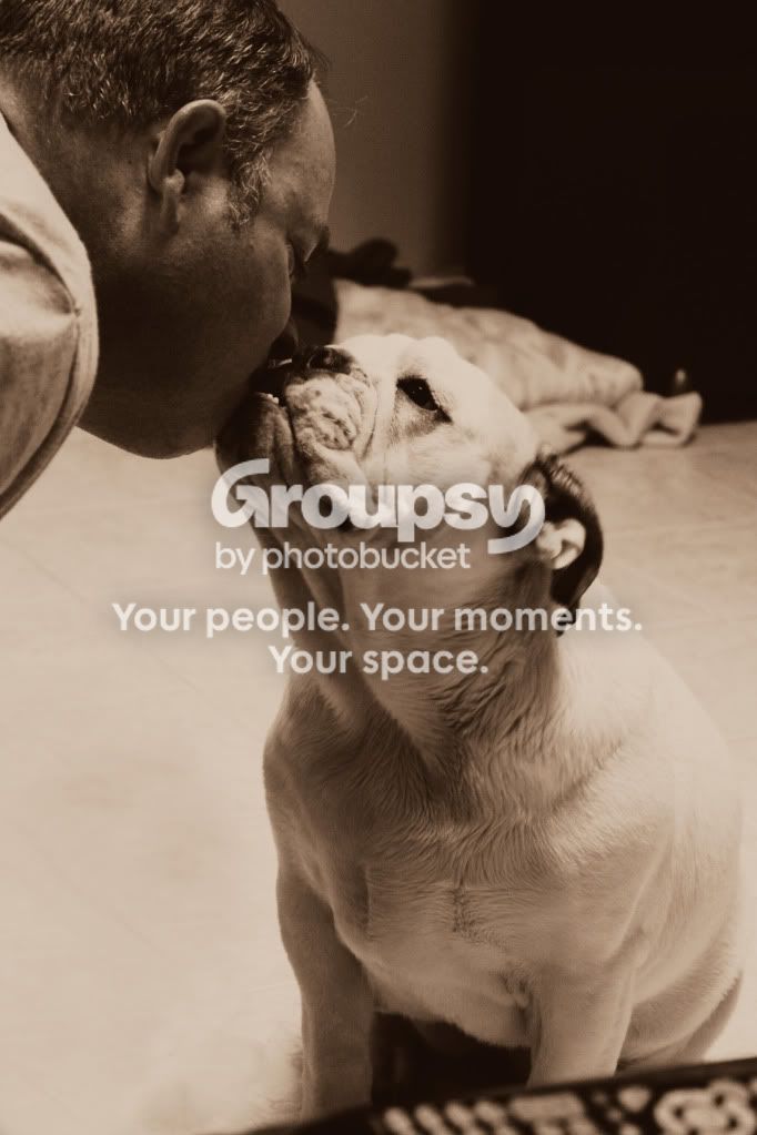
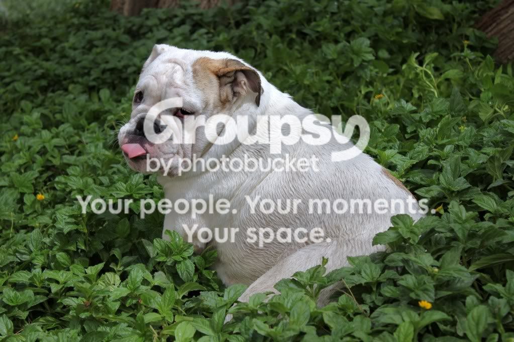
My opinion? That is one sad and depressed dog!
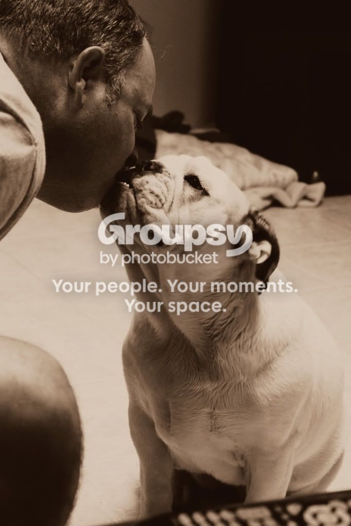
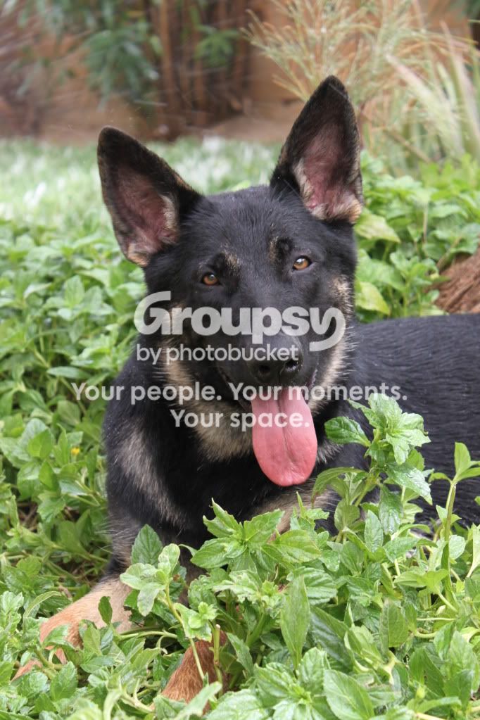
Some basics are missed: Soft focus on the eyes in #'s 1&2, center composition in #3 doesn't really do much to the image for me, #4 is cute for you but I don't think the sepia tone really adds. I don't know but I think the B&W may look better, but just needs a tiny adjustment to the highlights (bringing them down) to make sure the image isn't overpowering.
#3 is my favorite just because she looks so silly with her tongue like that, as well as the droopy face combined. It just screams "I'm sad, but oh so funny."


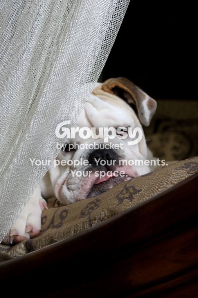
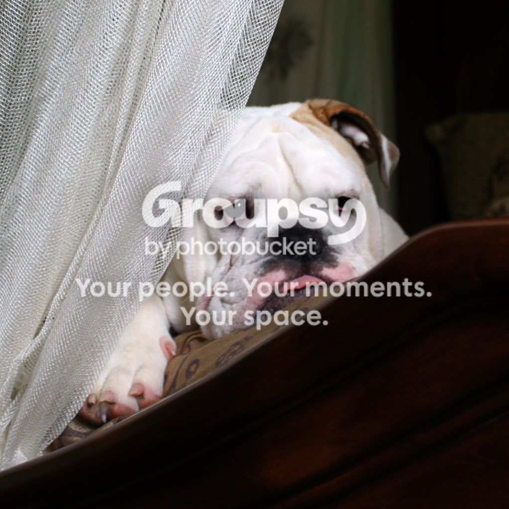

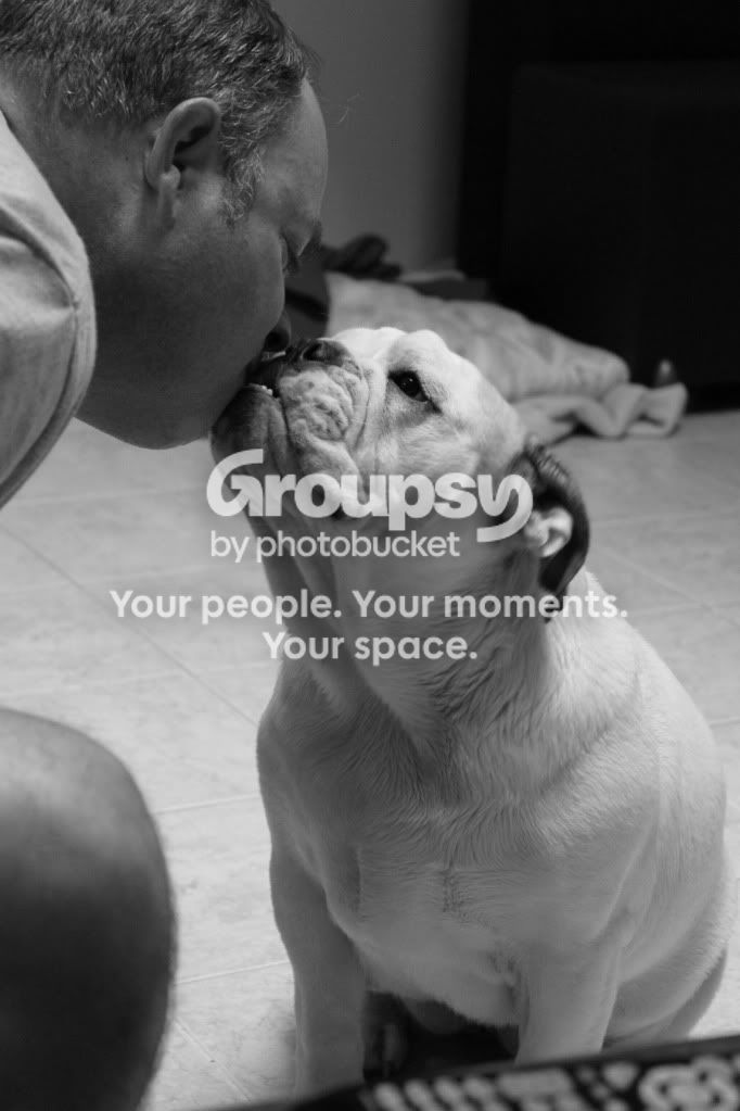


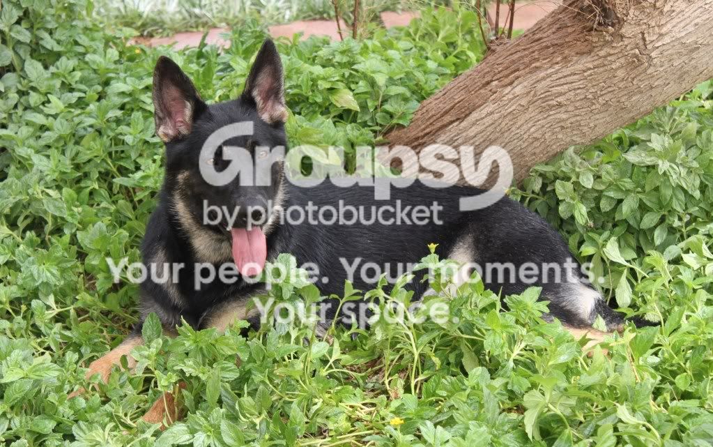
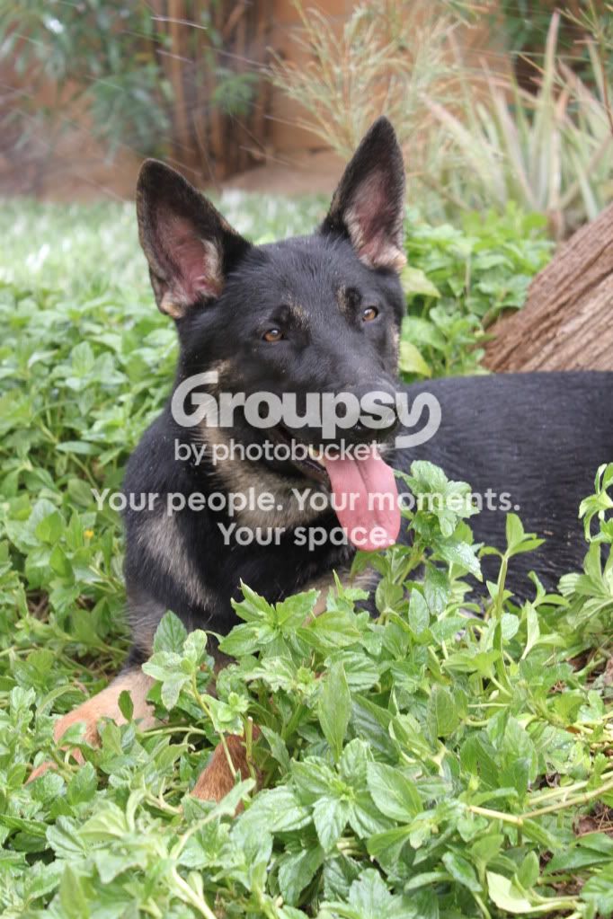

 I left the color the same. Its a very cute picture. And just keep in mind it was a quick edit, so it's not very good. Plus I'm on a laptop with out a mouse....great work!!!