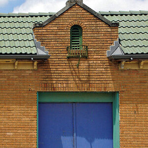
What a funky building, and really nice shots of it. The lines and shapes SCREAM for a B&W conversion, though.
(I wish I knew this place existed... Would've loved to spend an hour or three playing with my camera there last month.)
heheh... yeah, it's probably one of Boston's very few sort of "architectural oddities". Boston is so dull. Heck, this isn't even in Boston- it's in Cambridge!

I'm actually very glad you mentioned the b/w thing...
I actually very deliberately did not convert it. It's so close to monotone as it is, that you can almost think it's b/w (not really, but I hope you see what I mean). So in that first one, I not only left it, but I actually pushed the saturation a little because it brings out some funky greenish cast in that part jutting out and also a bit in the windows.
In the second one, I actually desaturated it by about 50%.
Just experiments in the treatment, of course, but I liked the end result.
Now that you've mentioned it and I've more explicitly pointed out what silly games I was playing, what do you think? Any thoughts?
Thanks for the comments!




![[No title]](/data/xfmg/thumbnail/34/34592-a6ba64e21d4257d5df6832c1bc9691f1.jpg?1734165588)
![[No title]](/data/xfmg/thumbnail/39/39181-9016b4d45a06d288c1a2b92565ba7837.jpg?1734173055)




![[No title]](/data/xfmg/thumbnail/42/42487-e35b2848c41aeeb5a93f21809f036a1d.jpg?1734177009)