Strong set - I really like 1 and 3, and 2 and 4 are decent. I'm going to have to get a little nit-picky to give C&C. I notice that these are labeled for different projects, so I assume that you had objectives which we don't know, so I'm just going to give my impression on the images as they stand on their own.
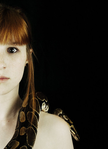
1) I really like the lighting, composition, and the expression on your (human) model. I don't know if the scared stiff look in her eye is genuine or coached, but it is certainly believable and adds to the emotional context of the image. If it were coached - and avoidable - I'd also have been interested in seeing her with other expressions. While the emotion here comes across as genuine it is also expected. I'd also be intrigued by a version of this in which the (human) model looks joyous, or bored, like having a large snake slithering across her torso is no big deal. The only real nitpick I have is that I would have liked to see the snake's head separated from her shoulder a bit, to spatially isolate it a tad and let it catch more light. But since I've never had much luck with animals taking direction I'd chalk this up to a "would've been nice".
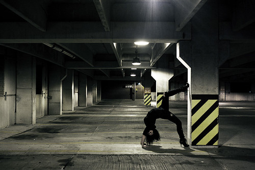
2) Kudos for trying something different with the pose here, but overall this image seems a bit disjointed to me. Certainly keep the elements of this shot in mind and use them elsewhere, but in this combination they're not quite working for me. Specifically:
-This structure has such symmetry, and such great leading lines, that to my eye the aisle wants to be centered. Unless there is a compelling reason not to, such as a large foreground object as your subject which you want to put off center, having these leading lines off center pulls the eye to the rear of the image off center, which just feels wrong to me.
-Again, great pose, but it gets lost a bit. With her up against the pillar and its yellow stripes, and with her left (raised) leg in line with the next pillar, the eye is drawn a bit away from her pose. Had she been in the middle of the aisle (with your or an assistant to help her into this pose, who then gets out of the frame), once the eye found her it would have stayed there more easily.
-Having her in all black isn't helping to draw the eye either.
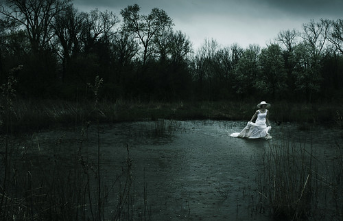
3) This one violates a bunch of "rules" (she's too far to the side and too vertically centered to be on a "rule of thirds" point - while the pond is too centered, she's facing out of the frame rather than into it, many people would say it's underexposed, the subject is too small in the frame, etc) - and it shows why rules are made to be broken. I love the feel of this and the narrative it tells. Great job using the white outfit in contrast to the dim surroundings to make her pop even in an "underexposed" image. Yeah, can't even offer specific alternatives to have tried, though I would be curious to see what else you got out of this shoot.
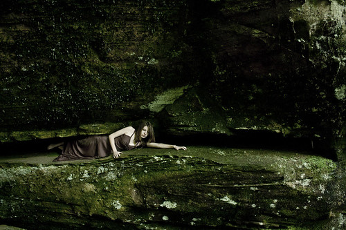
4) Another example of using the different color tones to make the subject pop - in this case her skin really stands out against the rock and her dress, so the eye goes directly there. I like that there is just enough light to show the texture and the layout of the rocks. The difference between this and #3 for me is that I'm not getting a narrative out of this image. She is too small in the frame for me to consider this a really good shot of her, and there's nothing that really grabs me about the pose. I still think it's a technically good image, just not a particularly compelling one.