Monitor Calibration - Intensity & White Point question, Prints not matching screen

Drew1992

TPF Noob!
Joined
Mar 27, 2011
Messages
71
Reaction score
2
Location
Montana
Can others edit my Photos
Photos NOT OK to edit
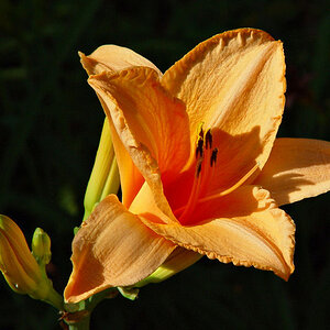
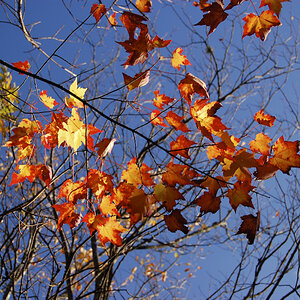
I edit on a calibrated NEC 24 inch monitor the MultiSync LCD 2490WUXi2 (via Spyder 3 using the Spectraview II software). I edit my RAW files in both LR3 & CS5 in the sRGB colorspace. I export in the sRGB colorspace and print my photos with a professional lab. My prints come back too dark, de-saturated, cooler in temperature, and my prints seem to have more blacks & reds and my screen shows more warm colors of yellow & orange. My photos on my monitor look great, just like I want. The prints on the other hand are very disappointing. I had been editing with a 140cd/m2 intensity in my calibration target profile.

So, I began to try to remedy the problem. I set my monitor to it's default settings, re-calibrated with Spyder 3, made sure my drivers were up-to-date, lowered my intensity to 120 cd/m2 and made some test prints. The test prints weren't much different than the ones I printed with a 140 cd/m2 intensity calibration. The only ones that looked better in brightness were the ones that I added a little more brightness to for test printing purposes(just to see what would make them look better).

All of the photos that I printed with 3-4 different calibration profiles, varying in intensity between 120 cd/m2-140cdm2 and either a gamma of 2.20 or sRGB gamma settings were less saturated, cooler in temp, darker, seemed to have more blacks, and the prints took on more reds, lacking some in the yellows & oranges.

What can I try to remedy this? Should I drop my intensity to 120cd/m2 and maybe increase my saturation/vibrancy a little as well as increase my brightness some,keep my gamma at 2.20 and maybe adjust my White Point? ? If I lowered my White Point between 5500-5800 would my photos become warmer? 6500K seems too cool? I want those warmer colors to show up in my prints, not just on my screen.

I would like my screen to match my prints as close as I can get. I realize it's a hot topic and can never be "perfect", but I am very serious about my work and I have put my editing on hold until I get this figured out. I have been editing for too long without making any prints(stupid stupid mistake that I am now paying for) and when I did finally order some prints, I was so disheartened that my calibration settings were off and my prints not matching my screen after many many hours of editing.

I edit in a fairly bright room during the day, but of course it's very dark when I edit at night. Should I be using a calibration for daytime editing and a separate one for night time editing? I edit at night in a completely dark room. My daytime editing is in a room with a window.

I welcome any and all feedback!

Thanks!


Last edited:
Have you tried sending a few test images to a different lab to see what the results would be? Also.. please post an image or two that you are having issues with. Many of us calibrate our monitors and should be able to to see if something is off.

Are you using one of the well known PRO labs? Like WHCC, Miller's, Nations, etc...?

This might interest you... Test Results: Best Online Photo Print Lab
 
$IMG_3329-Edit-Edit-Edit-2-Edit-Edit.jpg$IMG_3321-Edit-2-Edit-Edit-Edit-Edit-Edit-Edit-Edit.jpg$IMG_3210-Edit-Edit-Edit-Edit-Edit-Edit-Edit-Edit-Edit-Edit.jpg$IMG_0236-Edit-Edit-Edit-Edit.jpg$IMG_0141B-140cd-PE.jpg

I did order prints from another lab and I am waiting for them to be shipped to me. I should receive them in a day or two.

I made a custom photobook from a separate online company in December and it did not print to match my screen either. Same issues with the photos being too dark, colors off, etc. I am pretty sure it's my monitor, not the lab(s) I am using.

I will post a couple of photos. Let me know what you think. Thanks for that link. I will check it out!

If I posted these photos in the wrong place, please forgive me! I have never posted photos on here before.
 
Last edited:
I posted a few photos, let me know what you think.
Thanks!
 
I posted a few photos, let me know what you think.
Thanks!

Photos look reasonable color and exposure wise... so I don't think that is an issue...
 
Thanks. I really think that I can take care of the brightness issue by lowering my intensity to 120cd/m2.

Should I lower my White Point to somewhere between 5500-5800 to see if that brings some warmth back into my photos? Then, do some more test prints after lowering it?

The B&W(well, more of a warm B&W) below of the dad with his kids came out as more of a darker grey-ish color when printed. Very disappointing since I wanted a warmer feel to it. I like my photos to be warm and colorful, but not too over-saturated. I know that I can't get them to be a perfect match, but to be so very different really bothers me. I have stopped all of my PP until I can correct this.

Here's one more image. It is very warm(yellow) in color, but printed more of a light cream color. I know it's a trend right now, but I like to throw in a few vintage looking photos. By the way, that link was really interesting! Thanks for sharing it!

$IMG_3182-Edit-Edit-Edit-Edit-2-Edit.jpg
 
Last edited:
So what calibrated light source are you using to look at your photos? This is an honest question. You can't compare a print to a monitor side by side and expect comparable results without a lightbox. You need to consistently light the image up to the correct intensity to match your display. If you just look at the picture and think hmm it's a little cool, I'll just make my display cooler you'll achieve the right result but not for the reason you may guess. The reason being that in a dim room your eyes adjust to the display so when you light your print your eyes are adjusted to a different white point. It may look better at one point but then you take your print into another room and think wtf?

Also you'll never perfectly match the print and the screen due to the differences in gamut. One of the things I didn't see you mention is the word soft-proofing. That is making one colour profile appear as though it's another. Without soft-proofing your prints (which is what compensates for black point, and the off colour of paper compared to a screen) you'll never be able to match the tone of the image.

I suggest do a google for soft-proofing.
I suggest evaluate your room lighting and if you're trying to compare prints adjusting the colour balance of the monitor to match that of the lighting.

Your pictures look fine by the way.
 
Hi Garbz,
In all honesty, I am clueless about soft-proofing, lightbox, etc. I have always assumed that those things were for doing your own printing of your images. I have a lot more to learn! Ok, time to do some more reading, research, etc. Yes, I will google soft-proofing. Believe me, I will.

It bothers me so much that all of my hard work looks so different in print. I sometimes spend 30 min. or more on one photos during PP to get it to my creative liking. I am very serious about what I am doing and it's very important to me that I get as close of a match as possible. I realize that I cannot control how others view my photos on the web due to colorspace issues, uncalibrated monitors, etc but I want to do my part to get as close of a match of my prints as I can.

My room lighting is not the best set-up. I am actually editing in a room with an uncovered window and glass door. Although I have an office that's detached from our main house, it's not very convienent to use and still be able to be a part of my family on an everyday basis! ;-) My husband also utilizes it for his business and we enjoy separate workspaces ;-) Is it ok to edit in such an environment or should I create a "cave-like" workspace as I used to have in our detached office? I actually enjoy some daylight! But, I also want my prints to match! :)

How do I go about "adjusting the colour balance of the monitor to match that of the lighting" ? I really would like to know your thoughts. I am open to suggestions, as I want to learn and better myself as well as my work and working environment. I appreciate you taking the time to point these things out to me.
Thanks(about my photos) I appreciate that.
 
Last edited:
Well to make the best of a worst situation, most common software allows you to take an ambient light reading. This should give you the colour temperature of the light around you, you can try and match your monitor to that light reading (my guess is between 5000-6500k for light coming in from outside).

The other thing to do is check your settings. Do what curve are you calibrating to? sRGB, Gamma 2.2? L*, some other?

Softproofing and all that stuff is required whenever you want to compare your screen to something that is not your screen.
 
Hi Garbz,
In all honesty, I am clueless about soft-proofing, lightbox, etc. I have always assumed that those things were for doing your own printing of your images.
Tutorials on Color Management & Printing

Fine Art Printing for Photographers: Exhibition Quality Prints with Inkjet Printers, 2nd Edition

Most of what is in the Fine Art Printing book about color management, etc will also be valid for C-prints (Chromogenic prints - http://en.wikipedia.org/wiki/Chromogenic_color_print)
 
Last edited:
As an Amazon Associate we earn from qualifying purchases.
Hi Garbz,
I took an ambient light reading and the Sensor Ambient Light Light Measurement was 169 LUX(very high). It did not give a color temp reading?
I am thinking curtains right at the moment ;-) I have none over my windows in here.(yeah, stupid, I know)

Are you familiar with the Spectra View II software? I use it with a Spyder 3. In SV II under edit>preferences>Calibration Tab>Recommended Calibration Profile Steps, how many should I be using? It is currently set at 32 steps. Should I up it to 52 steps(for highest quality)?

Also in SV II under preferences>ICC Profile Tab>under Source of primary color chromaticities for ICC profile, should I choose Automatic or Factory Measurement? It is currently set on Automatic. One more thing in SV II, in preferences>Display tab>box is checked for Use Auto Luminance. Should I uncheck it?

Yesterday I re-calibrated my NEC monitor to: Target 5000K(calibrated at 5029K, 0.345, 0.357 CIE x,y) Delta E: 0.73 and 120 cd/m2 for my intensity(it calibrated at 119.1 cd/m2 and calibrated black level 0.47cd/m2) Gamma Curve: Target 1.80, Red: 0.641, 0.328 Green: 0.302, 0.614 Blue: 0.149, 0.066

I ran some test prints from some photos that I edited in the above calibration. Here are my findings:
Prints were MUCH closer for a print to screen match(that is, without serious soft-proofing using a lightbox, etc) but still had a few noticeable differences.
- Prints are slightly darker, but not terribly like before
- Slight to moderate greenish hue to my prints and seems to have more greens
- More contrast in prints?
- More blacks, darker areas and shadows are darker on prints compared to screen
- Prints seem to have less reds or red hues
- Prints don't look as soft as I'd like in some of my images
- B&W or B&W with color tones? in them are way off, more greenish hue, more yellows in some.

I ran some test prints last week from some previous calibrations(such as 6500K, 2.20 Gamma Curve, 140 cd/m2 or 6500K, 2.20 Gamma Curve, 120 cd/m2 or 6500K, SrGB Gamma Curve, 120cd/m2) and none of them are as close of a match as my latest calibration of 5000K, 1.80 Gamma Curve, 120 cd.m2

To get closer to my goal(without soft-proofing with a lightbox) do you suggest lowering my intensity again to get brighter prints(maybe like 115 or 110 cd/m2?) What can I do to adjust the greens & reds?

I realize that different labs can result in varying prints, but I plan to try to use the same lab if possible(a local professional lab, not walgreen's or walmart or any place like that!)
Should I get their ICC profile to attach to my images for soley printing at their lab? I am not quite sure how to embed that?

Honestly, am I obsessing too much about this?

Thank you so very much for answering all of my questions! It is greatly appreciated!
 
Thanks KmH, I will check it out!
 
Prints will always be somewhat different in color and brightness because they are on paper, not a backlit screen. If you know they are always darker than what you see, it's easiest to just adjust the image on the screen to a lighter version; test that out a couple of times to get an idea of how far apart the print is from the screen image. It's futile to do a lot of editing if you are trying to get exact matches. Edit for the differences as well as a good end product. If you are using an outside lab, give instructions such as "do not print dark, adjust to show details" or "balance color for good fleshtone". Softproofing will only go so far; if your calibration is even slightly off or your monitor is stronger on one color than another, softproofing means squat.
Once you know exactly what you're looking at and why, you won't tear your hair out.
 
Sometimes I'm not convinced the printers I print to have been calibrated
bigthumb.gif
 
LouR,
Thanks, I am discovering just that! I talked to my lab and they made some of the same suggestions as you just did regarding special intructions for printing, etc. Monitor calibration is such a frustrating thing! I feel like I have great equipment and have tried to educate myself the best I can. But, I am coming to realize that a print to screen match is never going to be perfect and as long as I do whatever I can on my part to get it as close as I can, that's all that I can do. Thanks so much for your advice and/or thoughts. I appreciate it! -)
 

Most reactions

Back
Top