My personal preference would be to put something on the gaps of the photos in the first collage (even just a thin black line like you have the white line in the second collage, or blend them together or some other technique). I don't like photos just thrown up next to each other without definition or blending or what have you, especially given the lighting difference on the third shot (the other two have a darker tone, then the background on the third shot throws the theme off). The third photo in the collage is nice, but maybe there is another darker photo you could use instead to make the collage seamless?
For the second collage, I don't understand the relation of the face to the wheel. It seems awkward. They are good individual photos (although the little area on the right side of the wheel being cropped off is a bit awkward), but don't really flow together in a collage. The color differences throw it off, too - maybe making the wheel the blue tint that the face is would help. It is discombobulated, no relation between the two photos.
Collages aren't easy to do, as there are a lot of factors to consider (lighting, coloring, relationship, shape, etc.). So, please don't take this the wrong way. The photos are good, just the collages could use some work to make sense.
")
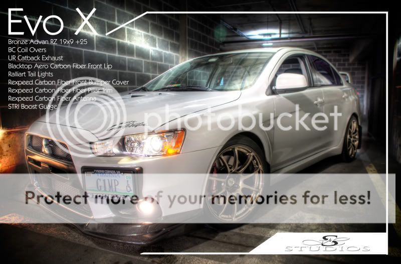
For the last photo, the white border starts and ends in odd places. Did you try making the top line a continuation of the top right line of the "X" (whether it be actually connected to it or have a gap [but be on the same plane] or have dots/dashes to connect it, etc.)? Did you try having the bottom line end under the bumper (move it up so it looks like it is going under the car to end)?
Just my opinions (as a graphic designer/photographer) that you can take or leave.


 hahaha
") ).
).

![[No title]](/data/xfmg/thumbnail/37/37624-7f9c9a5c8c7bcb5e62f67313e2e48dbc.jpg?1734170748)


![[No title]](/data/xfmg/thumbnail/42/42021-ffc326f5dc5b4c65ce53935e6e9e4338.jpg?1734176401)
![[No title]](/data/xfmg/thumbnail/34/34060-c81fb16d207094738be9b89a70ae1331.jpg?1734164477)


![[No title]](/data/xfmg/thumbnail/37/37627-c3d3ca879cdfbdb9e35acdcc7fcd4b3e.jpg?1734170751)

![[No title]](/data/xfmg/thumbnail/34/34061-e097813b3719866d07ff3e78e8119ffa.jpg?1734164477)