C&C per req:
1. This one really falls down compared to the rest of the set. Two big issues: key light is way too hot (nearly blown whites in the shirt & mortar-board and excessive specular highlights on the face) and her pose, is, well... just wrong. In general when posing you want the torso to be straight (she's leaning back), you don't want the upper-body more than 45 degrees to the camera, and you want (especially for women) the head, neck and chin slightly forward. To be brutally frank this makes her look like a chicken! The wrinkled shirt, well, that's not exactly a plus either...
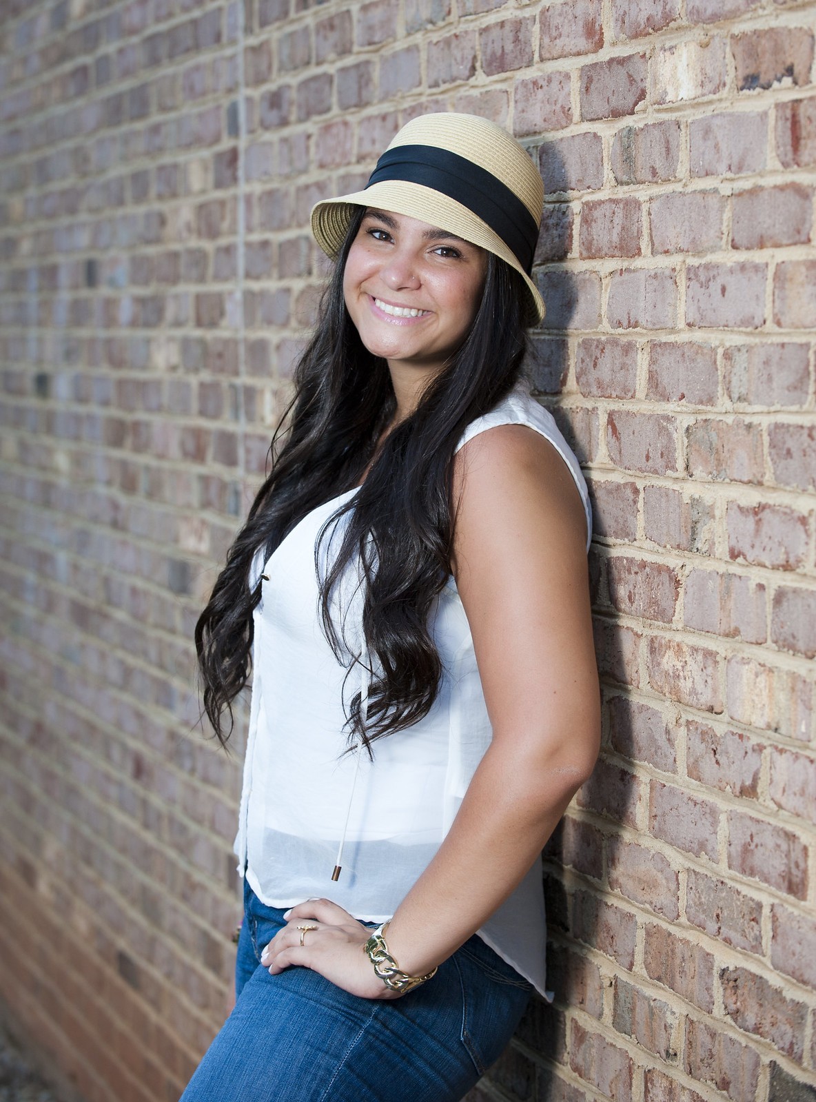
2. Okay, getting better. I can't say I find brick walls an overly attractive background, but I know they're in vogue, 'nuff said. Again the key is a bit hot and harsh. I suspect that your light is too far away and you're blasting too much power to make up for it. Closer lights and lower power are almost always better. Notice here how much better her pose and overall look is just by the fact that the wall has forced her back/neck straight and she's got one leg raised up a bit. GOOD smile!
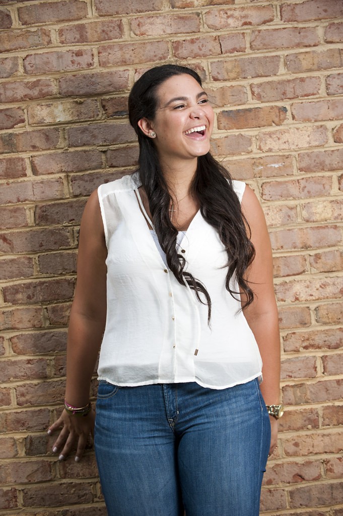
3. Great happy expression, a bit too square on to the camera and previous comments with respect to lighting & exposure apply. I see this one as a big hit on facebook (and I mean that in a good way).
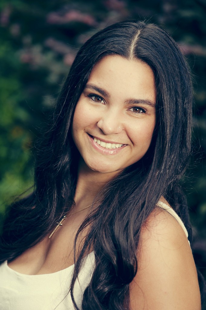
4. The money shot! This one has just about everything done right. Exposure is good (I can't comment too much on minor colour/WB since this monitoris wayyyy out of whack, calibration-wise), specular highlights are ideal, nice catchlights (they could be a little higher, and I'd try brightening the eyes a little more, but that's minor). Again, compare this one, where her chin is pushed slightly forward and down with #1... worlds apart!
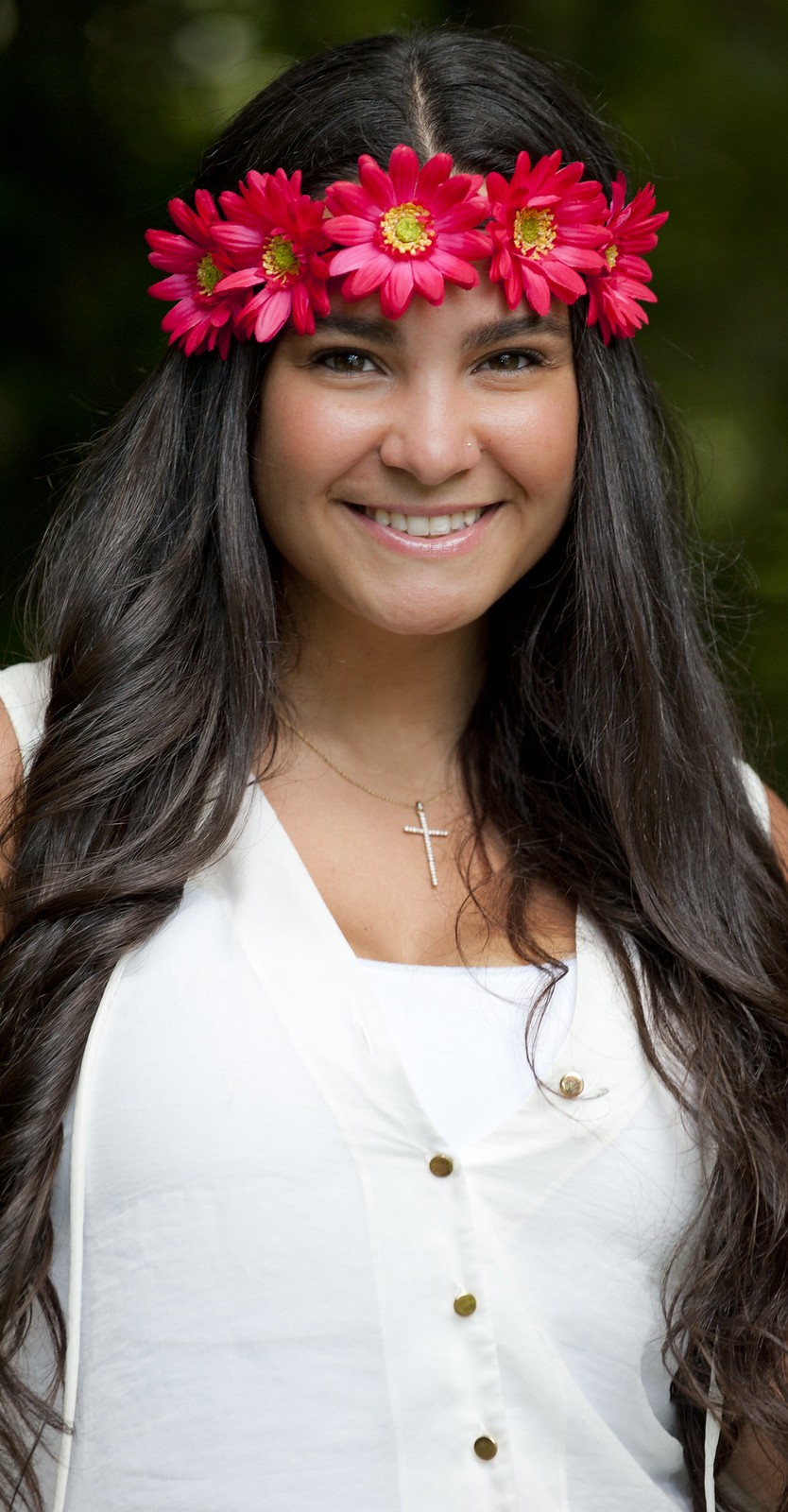
5. Nice; I think the whites are just a tad too hot, but I suspect they're recoverable in post. I'd do something about the little bits of arm you can see protruding from her dresses shoulder-straps; they look a bit incongrous.
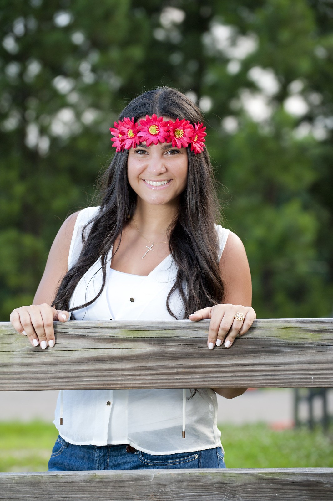
6. Mehh... nice enough, but again a bit hot on the key. Watch where things like the fence rail are in relation to the subject; above or below the breasts is fine, but cutting through them isn't really ideal. If you'd say given her an apple-box to stand on,a nd her hands a little more together, with her leaning a bit more forward, this would have been great!
Just my $00.02 worth - your mileage may vary.
~John


![[No title]](/data/xfmg/thumbnail/36/36303-10b1a386a9a00cf90fb7605d2d2c48c1.jpg?1734168634)


![[No title]](/data/xfmg/thumbnail/32/32004-4455324f0b4b5cc318dd35877147ac47.jpg?1734160793)
![[No title]](/data/xfmg/thumbnail/39/39472-acea19526f2c08f92fd1e95a92191bc2.jpg?1734173564)