Rosy
No longer a newbie, moving up!
- Joined
- May 9, 2011
- Messages
- 1,289
- Reaction score
- 328
- Location
- Raleigh NC
- Can others edit my Photos
- Photos OK to edit
Love having a junior for a daughter, I get to practice, practice practice
PLEASE CC
1

2

3
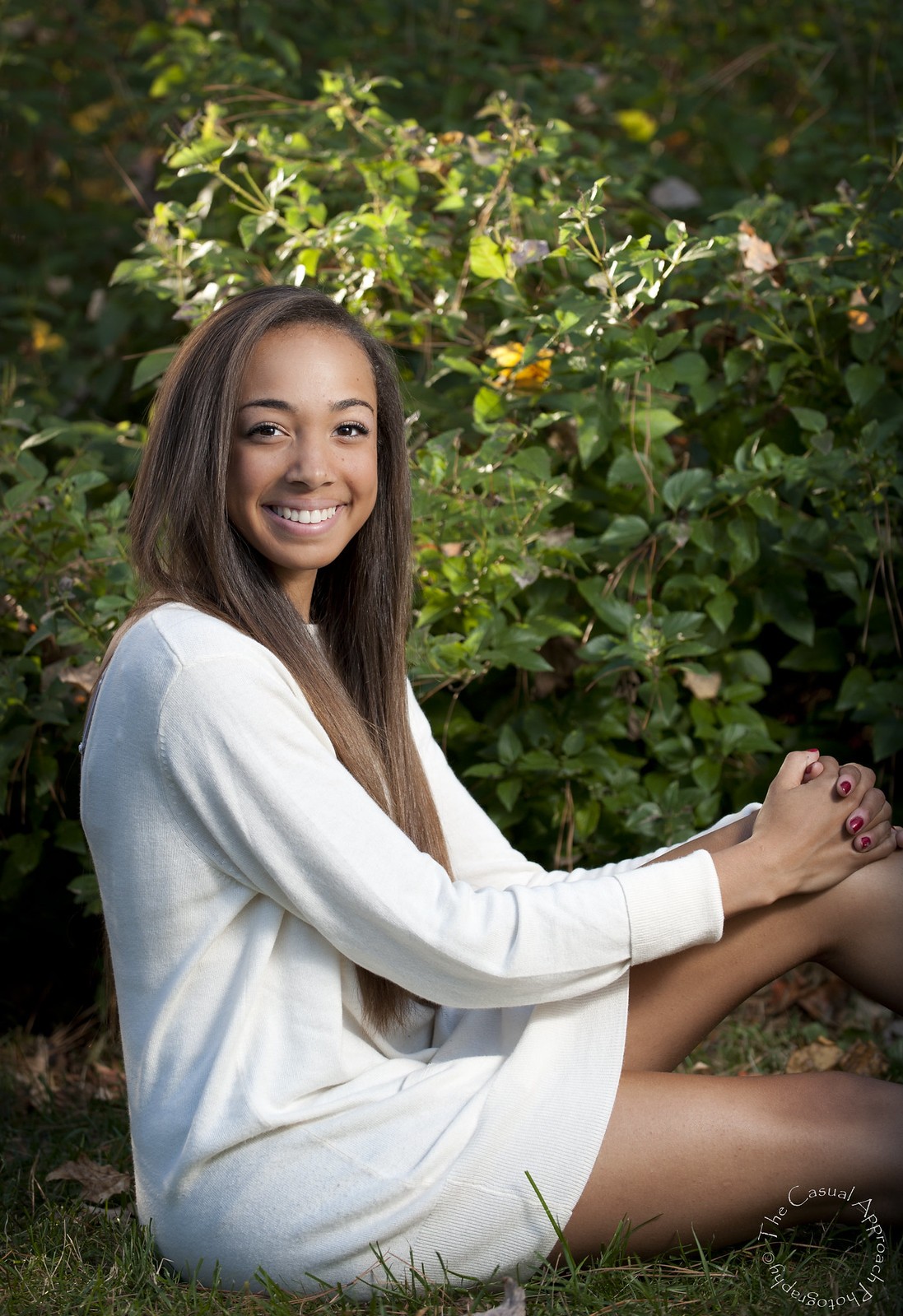
4
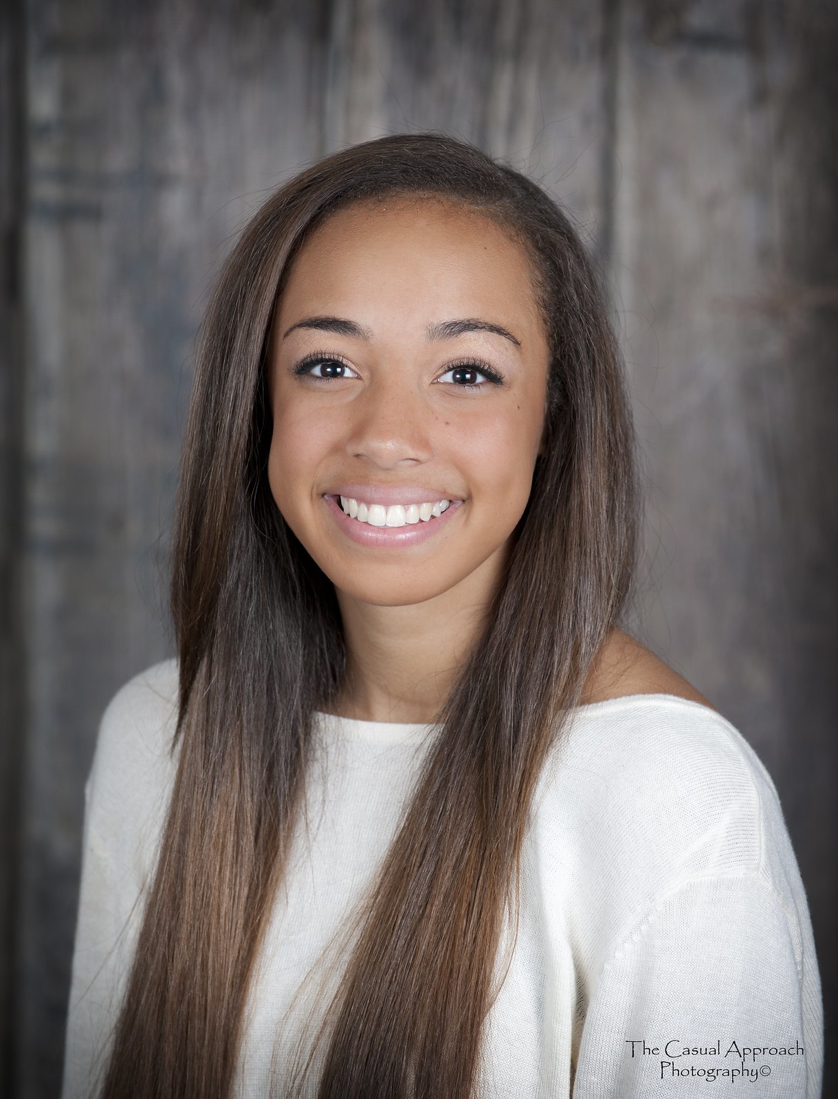
PLEASE CC
1
2
3
4
") ], but I feel your lighting is harsh and you lost too much of the ambient lighting in the background (high shutter spped?). The lighting looks much better and controlled on the rest.
], but I feel your lighting is harsh and you lost too much of the ambient lighting in the background (high shutter spped?). The lighting looks much better and controlled on the rest.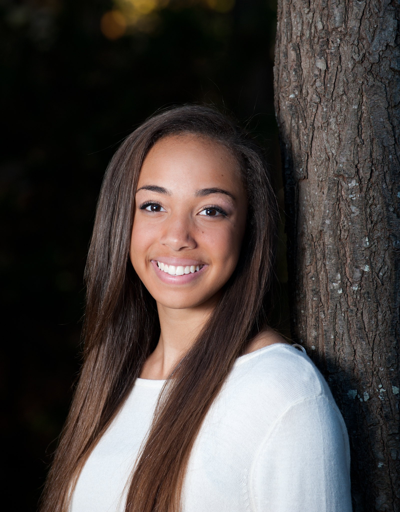

![[No title]](/data/xfmg/thumbnail/31/31746-12607d714ca2713b95250821c881aea9.jpg?1619734987)
![[No title]](/data/xfmg/thumbnail/31/31743-3b294ee78fc71e7bfc025b01eafb0c2d.jpg?1619734986)

![[No title]](/data/xfmg/thumbnail/38/38294-cb4a5aa0ded725d4c694e6eebe276f0d.jpg?1619738564)