There are multiple centers of interest here and my eye goes from one to the other.
I suggest you pick an interesting graphic combination that makes a composition and use only that.
For example.
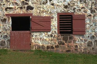
A basic problem with this is the bright and mottled wall that totally distracts from the windows/doors.
It WAS a composition to begin with; then, you edited it down to a mere passing observation, and threw away the majority of the shot, diluting it into one little snack-like bite...
It WAS a composition to begin with; then, you edited it down to a mere passing observation, and threw away the majority of the shot, diluting it into one little snack-like bite...
Thanks Derrel and Tex. I liked the shapes and patterns. Even the hinges on the top door mimiced the cross bracing on the lower doors. I THOUGHT it looked pretty cool then I read Travelers critque and thought "I'm going back to snapshots" .
Speaking of snapshots, you'll notice I learned to put my "just a barn scene" in JUST FOR FUN where you guys and gals can't rape and pillage it
There are a number of strong compositional elements working well together here. I like the triangulation, and think the off-centre upper door adds another level of interest, especially as it is the only one which is not open. The colours combine well to my eye. I like it.
The original works pretty well, but I would crop out the window on the left and crop the top so it's tight there as well (and I wouldn't add anything). Might be worth trying in bw. You'll get a lot of opinions on cropping anything with this many elements, but they're all just opinions. Do what works for you.
There are a number of strong compositional elements working well together here. I like the triangulation, and think the off-centre upper door adds another level of interest, especially as it is the only one which is not open. The colours combine well to my eye. I like it.
The original works pretty well, but I would crop out the window on the left and crop the top so it's tight there as well (and I wouldn't add anything). Might be worth trying in bw. You'll get a lot of opinions on cropping anything with this many elements, but they're all just opinions. Do what works for you.





 .
. 


![[No title]](/data/xfmg/thumbnail/39/39181-9016b4d45a06d288c1a2b92565ba7837.jpg?1734173055)
![[No title]](/data/xfmg/thumbnail/39/39180-3dcdd0aa38e4d015a48a17b0e45542fb.jpg?1734173054)