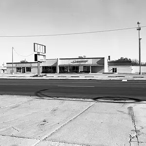
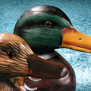
Number 1 doesn't really do anything for me. Can't put my finger on it. I don't think I like how it's composed. The building takes up most of the frame, yet it's hugging one side of the frame and away from the other side, just don't like the balance there.
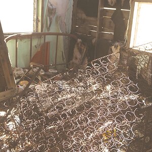
I actually like #2. It's bordering on overprocessed, but if you like the look, go with it. The barrel distortion is distracting to me. I prefer either a lot of it (like a fisheye) or none at all. The slightly curving lamp post just distracts me. But that's just my opinion.
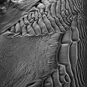
I like #3 also. Don't have much to say. Good composition, good lighting, good focus, and I like the processing. Nice work.