
DeepSpring
TPF Noob!
- Joined
- Jul 12, 2006
- Messages
- 1,451
- Reaction score
- 0
- Location
- Los Angeles
- Website
- www.joshualights.com
- Can others edit my Photos
- Photos OK to edit
So this is a movie we are just wrapping up in my film class so I decided to try to make a poster. I am looking for critique mainly on the lighting and the overal darkness of the picture. If you think some things should eb lighter or darker. Also how does the text work for you? thank you

") Cheers..
Cheers..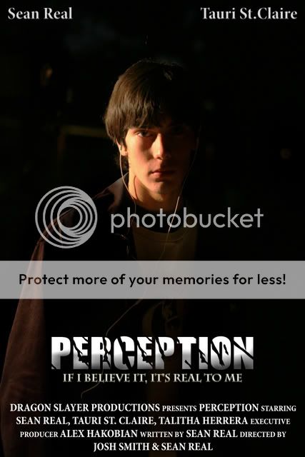
![[No title]](/data/xfmg/thumbnail/42/42397-30faa170de7ed9be38adf00b9b26a220.jpg?1619740167)
![[No title]](/data/xfmg/thumbnail/41/41756-e54235f9fba04c8380cd991845bb84b1.jpg?1619739881)
![[No title]](/data/xfmg/thumbnail/31/31753-281132967af6a422c89bcc0d6f16499a.jpg?1619734991)
![[No title]](/data/xfmg/thumbnail/36/36303-10b1a386a9a00cf90fb7605d2d2c48c1.jpg?1619737497)
![[No title]](/data/xfmg/thumbnail/31/31750-f3936d67895e1ef2756eb06d7b15fe9c.jpg?1619734990)