What's new

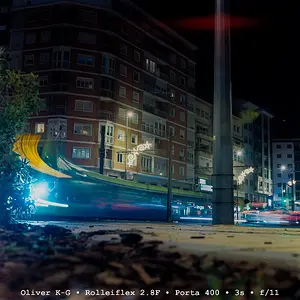
My 2nd image for photo exhibit - HARD critique needed

Personally I'd prefer colour. I don't like what's going on with the bridge thing to the right.
What's the exhibit it's going into?
 
Personally I'd prefer colour. I don't like what's going on with the bridge thing to the right.
What's the exhibit it's going into?

I have been invited to display my pieces at some artsy-fartsy coffee house/restaurant here in Baton Rouge for two months. I need about 12 images
 
DEFINITELY the color version. I am torn about the bridge/overpass on the right. It's dark, blocky, and doesn't fit the picture, BUT it keeps my eye bouncing back to the colorful side.
 
I prefer the B&W because the color one is over done. To my taste it is over saturated, i.e. the blue banner are flat blue, the red brick wall looks like poor HDR. On the pro side of the color image, I like how the color are stratified on the main building.

The B&W is more compatible with the old style of the building and its more gentle with the overall look of the picture. Concerning the "old-style" maybe you could try to get rid of the modern Toyota SUV on the right with a proper crop. It would also bring a little bit more the attention on the building that is the subject of the picture (i think). You could also try to boost the contrast a bit, are whatever that would make those star light pops a little bit more. These are only suggestions.
 
Its a little confusing because I see blue sky, yet the street is really dark. I guess it depends on the mood the coffee house is looking for. I am sure their are some different edits that you can do depending on what you are going for. Maybe its the white balance? I don't know, its tough to tell. Is the lower part of the building really that color, or is it white? Anyway to make the brick stand out more?

Maybe you should make 4-5 color versions, and post a poll on here as to which everyone likes best.
 
contrast slider set to 11.
 
Thanks for all the FB, I am leaning to the BW as well.

As for the dark streets, the image was taken at 5:00 in the morning, with the sun coming from the right of the scene. The thing on the right side of the image is just another building with a balcony (you are seeing the bottom side of the balcony). So this building is putting the shadow on the road. the shy is not blue, it is gray. It just finished raining about 15 minutes earlier.

The building is that color, kind of tan, with red lights on it, making it look coral. This is a typical street scene and architecture in the French Quarter of New Orleans and that is what I was trying to capture here.
 
I would crop the right side off and just have the street showing the leading line. JMHO

Oh and I prefer the b&w version best.
 
much better without the cars, still don't like all the contrast, saturation, and loss of detail done in post.
 
I prefer the B&W, the color just looks too overcooked for my taste. If you want to make it pop in a more subtle manner, have you ever used luminosity masks?

Compositionally I wish there was a tad more on the right, the leading line is great but it pulls me just a bit too far right. If you take a just a tad off the top it really changes the feel of the image by reducing sky, more confined which could work with the B&W. Also I would straighten the poles on the left, they are distorted a bit from the lens. If you play with your B&W conversion you should be able to get the fluer de lis to pop on the flags as well.

Overall nice scene and nice image. Congrats on your exhibit!
 
I don't know the proper words, but it seems blown out. Like the details are lost almost like being overexposed. Others are saying it was done in post - processing. Maybe so.

I do like it better without cars.
 
I can't see whether your images are ok to edit, so if not, then I apologise.
First I really like the shot, but I agree with other posters, there needs to be a lot more of the right or nothing. I have cropped and dipped the saturation a bit on this edit, for me it takes out the harshness of the processing and gives it a slightly old film look.
See what you think. At the end of the day, if you're happy with it, then you're the artist, and therefore its perfect.
$11982641365_ab7fe6db09_o.webp
 
I can't see whether your images are ok to edit, so if not, then I apologise.
First I really like the shot, but I agree with other posters, there needs to be a lot more of the right or nothing. I have cropped and dipped the saturation a bit on this edit, for me it takes out the harshness of the processing and gives it a slightly old film look.
See what you think. At the end of the day, if you're happy with it, then you're the artist, and therefore its perfect.
View attachment 64653

No problem editing my images (thats how we learn).

I do like that finish, not sure about the missing right side, I like the feel of the tight quarters of the streets in N.O.
 

Create an account or login to comment

You must be a member in order to leave a comment

Create account

Create an account on our community. It's easy!

Log in

Already have an account? Log in here.

Back
Top Bottom