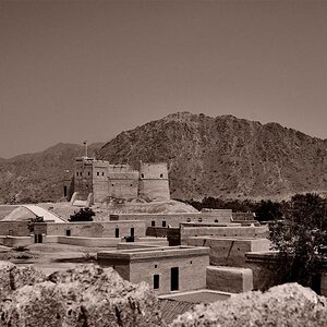
I prefer the B&W because the color one is over done. To my taste it is over saturated, i.e. the blue banner are flat blue, the red brick wall looks like poor HDR. On the pro side of the color image, I like how the color are stratified on the main building.
The B&W is more compatible with the old style of the building and its more gentle with the overall look of the picture. Concerning the "old-style" maybe you could try to get rid of the modern Toyota SUV on the right with a proper crop. It would also bring a little bit more the attention on the building that is the subject of the picture (i think). You could also try to boost the contrast a bit, are whatever that would make those star light pops a little bit more. These are only suggestions.