My Daughter & her fiance

heip

TPF Noob!
Joined
Apr 30, 2004
Messages
502
Reaction score
0
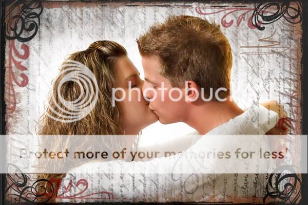
Shot these a couple nights back. What do you think about the border? I'm on the fence, usally not a big fan of so much going on.
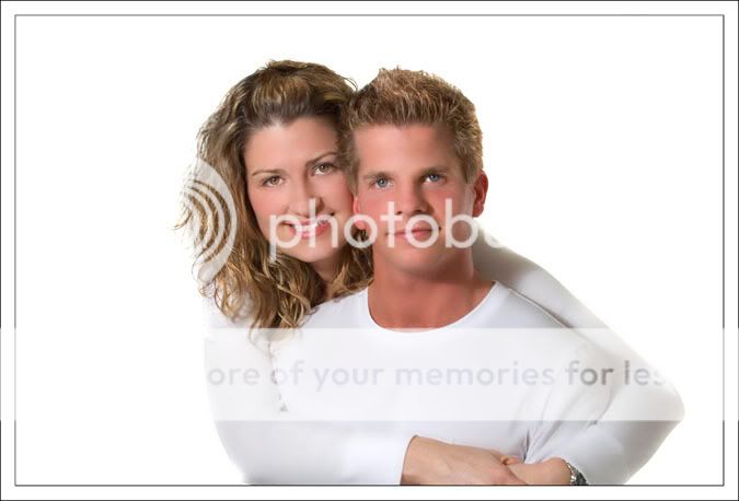
I know I shouldn't crop through the hands on the first one but today it works for me, tomorrow, who knows. :) Thanks for looking.

1.

_DSC1478.jpg


2.

_DSC1448border.jpg


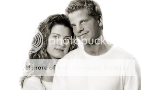
3.

_DSC1559bw.jpg
 
The second one is pretty hot-potatoes, seasoned with garlic sauce.

The first one, yea I think the cropped hands are a little distracting, the rest is cool though. The third one though, I see what you were going for but that soft/blurred look. . .no go to my eyeballs. Plus the cropped hair.

The second one though is money, with what you've done to it.
 
The shots are really nice.

On the second shot, his nose is really distorted and not in a pleasant way. I'm not quite sure if I like the border, kind of like for a second then hate it and back and forth, so I don't know.

But really good work overall.
 
Love the pictures, but not a great fan of the borders.

I personally like the toned B&W on the last pic. I would prefer the second with similar PP effects to #3 but less the border. Just IMO though, great pics :D
 
the first one , the background is too bright....turn down the brightnest on your layer so it meshes better with them....i would crop it tighter and get rid of the hands more

i like #2, but would prefer more 'space' around them and try it in b&w

dont mind that his head is clipped, but dont care for the pp, again, turn down the background and maybe just b&w rather than the toned image here...

good looking people, btw!
 
Huge fan of the border on the second.
Is that Graphic Authority by chance.

I totally love the photographs as well. I love the processing, comp, everything. Dead on perfect IMHO. But I'm a big fan of both the funky, and the ummmped proccessing.
 
I think #2 is just smashing :) He looks so much like a former friends husband! Adorable couple.
 
Thanks everyone for your comments and suggestions!!

NJ, thanks...been away too long.
 
I have a problem with the 3rd one. There faces are telling a story and its not a happy one. He looks a bit cocky, and she is hanging on.

Ok maybe I am reading into it a bit much.
 
First thing I noticed was the white background and their white tops. Good job in separating their clothing from the background. I agree with emogirl with the background being too bright with your first photo.
 
I have a problem with the 3rd one. There faces are telling a story and its not a happy one. He looks a bit cocky, and she is hanging on.

Ok maybe I am reading into it a bit much.

I didn't want to say anything, but I agree.

Nothing against your daughter, but he isn't sending the best vibe.

just my humble $.02...

<ducks for cover>
 
I would love to see number two in sepia, I think it would really work great with the image and the border effect.

With number three I would have liked to see the whole head of the gentleman. My general rule is, if one head is cropped off, crop the other. (And even tho I say that, my favorite photo I have taken at a wedding has the grooms head cropped off)
 

Most reactions

New Topics

Back
Top