My first day shooting! Be Gentle. C&C

Matt24138

TPF Noob!
Joined
Jun 20, 2011
Messages
113
Reaction score
7
Location
Delaware
Can others edit my Photos
Photos OK to edit
Ok. I shot these in shutter priority. I am trying to learn and expirement but I feel these were the best to come out of the day. I have not edited these I have GIMP but have not used it at all if you have any suggestions on how I should edit them please be my guest. I hhave been reading my manual and understanding exposure and while my kid was taking a nap I ran out and got some shots. It was around 1 p.m. so I know it wasnt the best time due to the sun. Being a single parent I gotta shoot when I can. Well here goes.
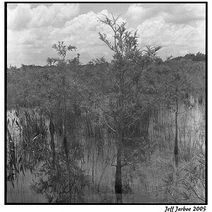
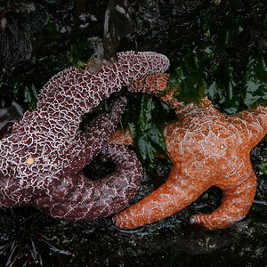
1.

first shoot 022 by Misfit0138, on Flickr
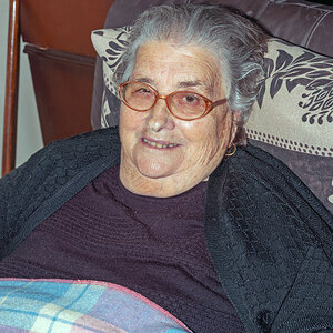
2.

first shoot 085 by Misfit0138, on Flickr
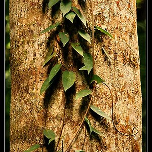
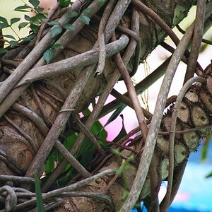
3.
first shoot 081 by Misfit0138, on Flickr
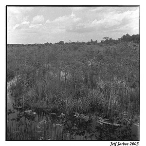
4.
first shoot 120 by Misfit0138, on Flickr
I hope I did this right. I really want to get good at this so thanks in advance for your help.
 
Last edited:
Looks like they are just snapshots. What do you think of those shots and why did you take em? If you respond to that, we will have a much better responds. Oh yeah, fix the link cause most people won't click on those links.
 
1. I took because the crooked path of the nails reminded me of life. 2. I liked the way the blue stood out in front of the greenery and blackness in the spaces in between. 3. I was going for an abandoned beach feel. 4. The red jumped out at me as it was the only thing vibrant growing there.
 
Good answers Matt. At least you used a thought process.

#1 - I like the leading lines, but methinks you may be a bit too low in your PoV. Reason being is that there is a tell-tale of the bottom of the foremost board. You have a dust bunny at the end of the boardwalk above the horizon.

#2 - Research difussers.

#3 - I got nothing for ya.

#4 - If red was the preeminent feature, then you should have given it more weight in the image.
 
Comments for FWIW...my 0.02¢

#1. Not too bad, you have all the nice converging lines along the boardwalk, except there is nothing to see where they converge, except a dust spot on your sensor...this would have been better to have had something to see at the end of the boardwalk...big tree, clouds, people...well you get the idea. As far as the "nails" are concerned, I did not see them until you mentioned them...maybe a different POV might have brought out this...this one does not do that, at least for me. The nails are really not dominant in this image and thus it is easy to miss them.

#2. I agree with kundalini about the diffuser...this flower is nicely placed in the image from a composition perspective, but the top of the flower is blown out and the front is in shadow. A fill flash with a diffuser would have worked, or a reflector to place light on the front of the flower and maybe prevent the top of it blowing out.

#3. Abandoned beach - doesn't really get to me that that is what you are trying to convey...if that was the theme, then I would have expected to see a picture of a long stretch of beach with no one on it and an image shot in a vertical mode as opposed to the horizontal one shown here. Maybe something to do with the gull might have been better (my opinion only).

#4. I agree with kundalini about the emphasis. If you could take this one again, you might try a number of different compositions...get rid of the white daisies in the foreground and have the daisies in the back ground as part of the bokeh...compose an image of the red flower (if that is what it is?) with the green grass behind it and don't include any of the daisies at all...I am sure there are lots of others...

You have a good start because you at least have some things in mind when you capture your images, now you just have to work on making sure that what you see is what others also see in your images - this is really what composition is all about - search it out on the web as there are thousands of sites with different ideas about various aspects of composition. You will also find that some of the web sites on "web design" and look for "principles and elements of design" as well, they wil also give you some of the basics. HTH.

Cheers,

WesternGuy
 
Last edited:
It seems you at least know about the ROT.

#1 has strong leading lines that lead to - nothing.

I would have shot #2 & #4 as verticals rather than as horizontals. The space on the right of each is not adding to the image.

#3 I would have gotten a lot closer to the bird, either by zooming the lens or approaching it.
 

Most reactions

Back
Top