Whoa. 12 very different photos ... had to take notes on a piece of paper on the side in order to pass any comments that I hope will also make sense to you on your pics here.
Before I start:
Welcome to ThePhotoForum!
Now on to what I have put down on that paper here:
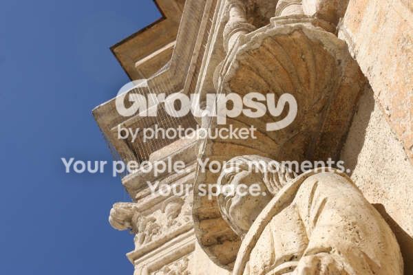
Photo 2 (my paper says) has some very nice colours and a good point of view or perspective or angle (whichever is the correct term here). The sky is just lovely and the soft off-white colour of the stonework contrasts with it well. The shadows fall in a pleasing manner. I wonder why, when taken with a 20D, this one would have all this noise, for a picture taken in broad daylight? I can only guess you forgot to change ISO back after you had been inside the church and boosted it to 1600?
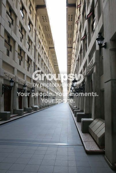
In Photo 4 I just LOVE the vanishing point. (I will love it in every photo that has one, I think

) Sky and end of that narrow street are a bit blown out, though. Maybe you should have exposed on the brightest spot? I really dig the chosen depth of field here (shortened to DOF here) - do you remember the aperture you chose for this one?
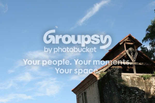
The point of view (POV) in Photo 5 does not appeal to me at all. It leaves way too much space to the left of the house and above it. To still include the moon into the frame you may well crop it and not lose the moon and them it could become more exciting - test it out, will you?
The colours in Photo 6 are nice. Quite muted, interesting photo of a large cruise ship at dusk. But it shows some camera shake because of the low light, so the next step should be towards a tripod

.
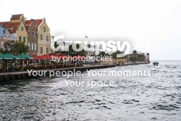
In Photo 8 your horizon is in the very centre of the photo. This tends to lend a somewhat boring aspect to pictures, somehow our eyes are more pleased by a slightly different division of things. You will come across the expression "Rule of Thirds" more and more often, and it might helped this photo if you had shifted the horizon up so it would have been the bottom border to the uppermost third of the photo, the houses would have formed the centre third and more water the bottom... I am not suggesting to include more sky than water in this one since the sky is bland and featureless here.
You might want to reconsider composition of Photo 12 under the same aspects.
I hope this does not make you mad with me but you feel it helps you a little!?!?!










![[No title]](/data/xfmg/thumbnail/34/34041-c8aed4d2c55b167d1ec03d9cfbaca453.jpg?1734164448)