I'm not a fan.
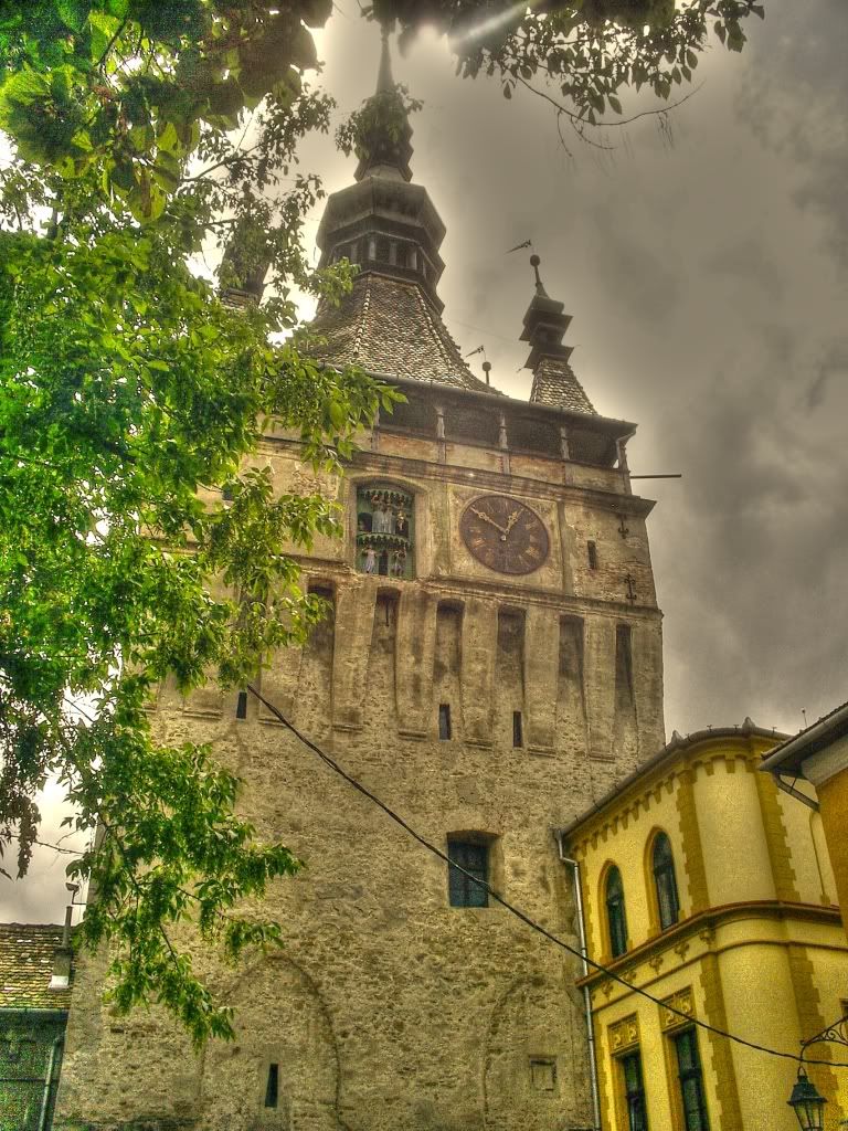
I dont like how the tops of the church kind of mesh in with the clouds. HDR for me is about pulling out detail in a scene that has a high dynamic range. In this image, the top of the church doesnt have much detai. It goes from a darkish greyish mass up top to more saturated and bright colours (trees and yellow). The green of the trees are not consistent, from bright on the bottom to murky grey up top. I dont like the halos either.
Composition wise its not bad. I see a lamp post or something in the lower right of the frame that looks a bit odd...the fact that its cut as it is makes me think you should either include more or none. I dont mind the tree in the front, gives the image a kind of "hidden church" feel.
This is just not the type of HDR that I like. If you were going for the cartoony look, then push it more and make it obvious that is what you are doing. This middle ground between real and cartoon is just odd to me.


![[No title]](/data/xfmg/thumbnail/41/41786-0de67cacf7270937b4833f67d003f9c2.jpg?1734176090)


