What's new

My First "Keepers" for C&C

robEMPire

TPF Noob!
Joined
Feb 17, 2011
Messages
12
Reaction score
0
Location
Seattle WA
Can others edit my Photos
Photos OK to edit
Bought my first non P&S camera (a Canon T2i) just over a month ago and took a pretty useless class at the local community college. Been trying to figure things out for myself, but unfortunately Seattle weather this time of year doesn't always make it easy for me.

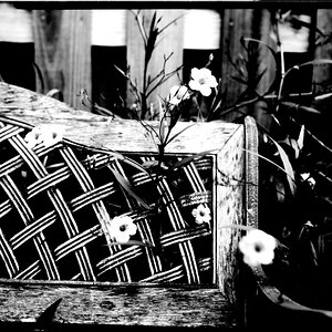
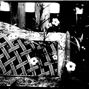
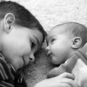
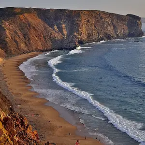
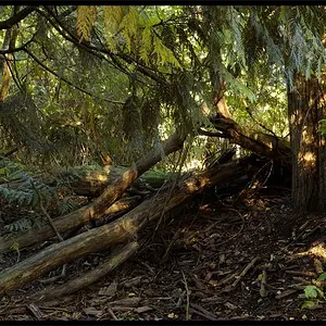
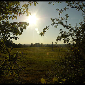
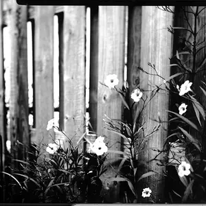
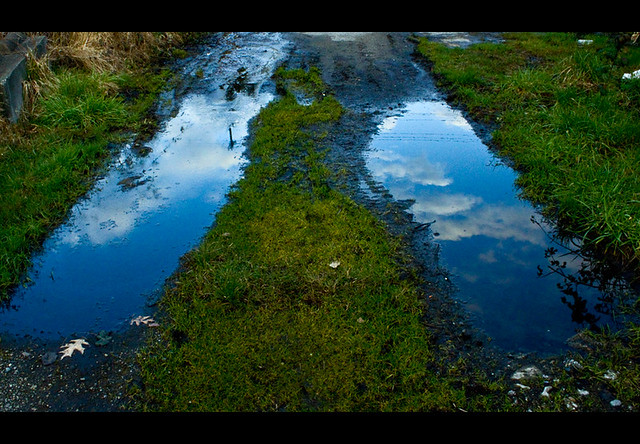
These are 3 of maybe 10 keepers out of 1,500+ taken. Big time trial and error mode right now but my ratio of quality to crap is improving I think.

Grateful for any comments, criticism, advise or dirty jokes. Please keep in mind that I'm still shooting with the little 18-55mm kit lens and have yet to buy more serious glass or any filters.
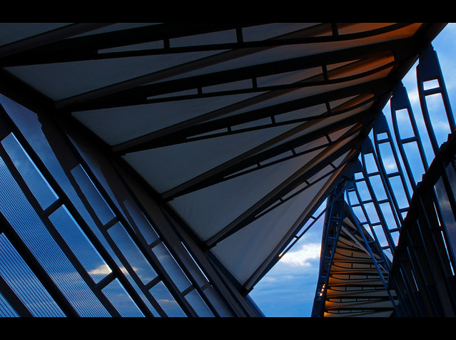
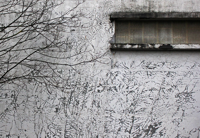


I think #2 very nice composition and color.
 
Although I like the lines and colors of #1 & 2 I think #3 is my favorite
 
You definitely have an eye for photography. I think that you picked your subjects well and did a good gob in making them interesting but you still have room for improvement.

1- I think this one could use a different angle but I like the idea. perhaps lower to the ground and closer to just one of the puddles would improve the composition.
2- this is your best one IMO. Maybe slightly under exposed but not in a bad way.
3- I like this one but it either need something more in it or just a tighter crop.

Keep it up!
 
Really digging #2 , i would have loved to see you shoot more towards the center but that's ok, i think it works in your case. And i think just about everyone who started photography had to take tons of images and only had a couple keepers but that's just part of the venture. I have a feeling you'll do great in the future
 
Nice work! Love 2 and 3 and some aspects of 1. I think it's because 1 is too symmetrical...but it's really sharp and I love the perfect reflections.
 
I really like all of them.
#2 is stunning with subtle HDR work and beautiful lines and composition.

Just curious, what is the reasoning behind the letterboxing (black bars above/below) on #1 and #2?
 
You've definitley got a good eye! #2 is pretty cool looking. #3 at first I was like hmmm.....then I was like oh wow! the markings on the wall totally blend in with the tree.....it's like an optical illusion or something. Awesome!
 
Thanks everyone for the kind words and helpful suggestions, much appreciated!

inaka, to answer your question about the letterboxing, I think it makes the images pop a little more. When I started using the cropping tool in photoshop I couldn't help but notice that the images looked far more vibrant with the black cropping box around them. I don't want to put each in a full black box because then they look like motivational posters fit for a conference room.
 

Create an account or login to comment

You must be a member in order to leave a comment

Create account

Create an account on our community. It's easy!

Log in

Already have an account? Log in here.

Back
Top Bottom