What's new

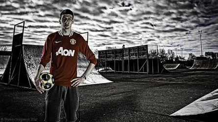
My First 'Real' Composite

Mot

TPF Noob!
Joined
Aug 29, 2011
Messages
208
Reaction score
32
Location
Cumbria, England
Can others edit my Photos
Photos OK to edit
As quite a few of may have noticed one of the current trends is to create composite images, several images combined to create what often looks like a hyper-real environment. After looking at Chris Clor, Dean and Bradshaw and even Dave Hill I decided I wanted to have a go.

I skimmed through Lightroom to have a look for a portrait and background that merged convincingly. I found two that I am relatively happy with, it could have been worse, so keep this in mind when you comment! I know that the more experienced compositors use dodging and burning techniques to make their images more convincing but I haven't gained enough experience to do this effectively! In certain scenes it can even be necessary to change the colour temperature of certain lights in the scene! I have sharpened and done other stuff to create the strange composite effect.

Anyway, I'm still at the stage where I think it's semi-convincing. I know in a few days I'll probably hurl when I look at it but I'll just have to wait! I know it's not amazing but I'm hoping that the effect appears less obvious if you didn't see the image separately.

DELETED B/C IRRELEVENT
​

Ideas, thoughts and comments are why it's here so please do your worst!

EDIT:

Based on stuff like, it's like a combination of all the styles:

http://thecreativefinder.com/userfiles/members/chrisclor/4252/16.jpg
http://thecreativefinder.com/userfiles/members/chrisclor/4252/07.jpg
http://www.photonasia.net/wp-content/uploads/2011/11/dean01-600x400.jpg
http://imageshack.us/photo/my-images/40/davehill07.jpg/
 
Last edited:
The white edges and heavy heavy post are a dead giveaway. The people you mentioned, if they do a composite, "shoot for the edit". Shoot them on seamless or a BG that can cut easily without contaminating the subject, gray or chroma green.


This would have looked 100x better had you been on location, with your strobes, doing this in camera and not in post.
 
The person was actually shot in a studio, the white edges are the halo from the snoot behind him. As I have said they weren't shot with each other in mind, I wouldn't have wanted a halo round him like that!

In terms of editing, yeah, it's heavy. I don't like it either but it's actually the look that a lot of the composite images have! Ridiculous, I know!

I agree about shooting on location, I'd love to be able to do that! Unfortunately I can't drive any lighting kits anywhere.

Here's the images seperately!

proof.jpg
 
It's really just very obvious that the person has been 'shopped in to the photo.
 
It's really just very obvious that the person has been 'shopped in to the photo.

Thanks, I don't disagree. How do you feel it compares to the other hyper-real composites.
 
I don't know, show me a link to some examples.
 
There's four links in the original post. They're perhaps not the greatest examples but they are similar.

Here's one link to a few examples.

Of course all of those are going to be far better, they were shot together by professionals and edited by more professionals! Take it how it is, a noob photographer and a noob photoshopper attempting to edit together two unrelated photos!

Here's a gallery of Dean Bradshaw's composites. These are what I am going to attempt in the future. It would be great if anyone had any guides or advice for composite building.
 
Last edited:
Well, in the last five days I've been at it again. I know it's a steep learning curve, and I've got a way to go yet, but I would really appreciate some feedback on my latest attempt. This whole composite thing is a journey but I'll never reach the end unless I get some direction.

$TheFinshedOneCropped-.webp

I'm trying to achieve a very specific effect, not ultimate realism, but a hyper-reality. Please only comment if you have seen or create this style yourself, I have posted plenty of examples in previous posts to you might be interested in them.

This latest piece is far, far away from what I want to be creating, I'm just strugging at this stage. Part of it is the original portrait file is sharper than the background so it's difficult to marry them up anyway. I shot with a 5D for both, 50mm 1.4 for the portrait and 20mm 2.8 for the background. The portrait has three lights, an open dish acting as mock-sun and two medium softboxes on the front.

Oh! Ignore the fact that he has a football in a skatepark. I was going to shoot for both composites but he didn't have his board and the football pitch was reserved!
 
Last edited:
In the first one, the light is coming from behind his shoulder. In the background you chose the light is coming from the top right of the frame- had you kept the direction of the light source the same you would have pulled it off much better IMO. (not flipped him horizontally.

Or not- looking again I see the light on his face matches what you did much better- but in the finished product there is light on his near shoulder that seems out of place. Dunno...
 
Trash it.

Thanks for the advice. I'll surely keep in mind all of your tips.

I can't be bothered asking you to expand and give me actual reasons but keep in mind that I'm not asking you to like the picture but rather compare it to photos in the same category and help me improve it. Telling me to "trash it." hardly gives me guidance.
 
compositing is tough, keep at it. The most important part is matching the light exactly, otherwise people will look at it and get a funny feeling even if they cant put their finger on it.
The few times I have really pulled it off I was shooting deliberatly to composite, try that and see how it works out.
 
If you like the style, then keep working on it. Google and learn how to composite more efficiently, and keep practicing. It's not something that personally calls to me, but if it does to you, by all means. The composition is good, the exposures look good. Keep st it :)
 
If you like the style, then keep working on it. Google and learn how to composite more efficiently, and keep practicing. It's not something that personally calls to me, but if it does to you, by all means. The composition is good, the exposures look good. Keep st it :)

I feel you're the first person to truly understand the thread.

I actually don't like the style that much. My reason for doing it is to become more proficient in photoshop and simply gain more skills in photography. I'm finding that to whoever I show it I receive a hugely negative reaction almost entirely because it looks HDR, fake and is not true photography. All I wanted was for some real advice so I can focus on practising the areas that needed it!

Spacefuzz, are you referencing the now deleted first image or the second?
 

Create an account or login to comment

You must be a member in order to leave a comment

Create account

Create an account on our community. It's easy!

Log in

Already have an account? Log in here.

Back
Top Bottom