C&C per req:
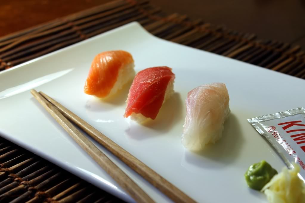
This is a good start, but I see a few areas for improvement. First off, I think the white plate works well. Colourful food, plain dish, plain food, colourful dish. That aside, we have no idea whether it's cheap or expensive. For all the average viewer knows, it all came from the dollar store.
Schwetty's comment about the soya-sauce packet is spot on; head down to the dollar store and find a small, appropriately styled dish and empty a few sauce packets into it, UNLESS this image is specifically intended to sell this meal. That is: It will be placed on a menu board to show a potential customer what their order consists of.
Increase your depth of field (use a smaller aperture). All of the food should be in sharp focus. If you want me to buy the food, it needs to be clearly seen. On that, ALL of the food should be visible; in this case, the cropped sauce packet and chop-sticks are rather visually jarring.
Next, lighting: You really need a second light from camera left to reduce the shadows and allow for that increased aperture. As well perhaps a slight saturation increase.
I would also find something to use instead of the bamboo mat. Linear patterns can distract the eye from the subject. In fact, if you wanted to go for a really dramatic image, I would support the plate on a stand and go for a totally black background.
Just my $00.02 worth - your mileage may vary.
~John