My friend Carson, C&C please!

malloryw

TPF Noob!
Joined
May 14, 2012
Messages
25
Reaction score
1
Location
Florida
Website
www.mallorywilliams.com
Can others edit my Photos
Photos NOT OK to edit
I hope I've uploaded these properly. Forgot how to here for a second, lol
I haven't been on in a while due to getting way too angry and someone for falsely accusing me when I was last on. But I'm back and happy to be posting again! :)
I work with my friend Carson quite a lot, both in personal fun photo shoots and in professional modeling photo shoots, so she's just a go to subject for me.
Some of these are from some of the days that we did face painting shoots with some other girls.
These are all just some that I've taken for fun of her to practice her modeling and for my to practice shooting when my business is slow. Please give any C&C, I just want to improve where I can.
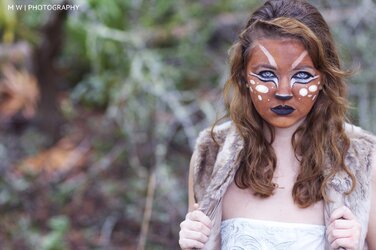
1

$IMG_5584.jpg

2
$Carson edit 3.jpg
3
$IMG_5602.jpg
4
$Carson hand.jpg
5
$Carson lace close up.jpg
6
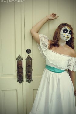
$carson door arm.jpg

*edit* I've never noticed before but I feel like after uploading them, it has reduced the vibrant colors of these. But that's fine :)
 
Generally, for a given "look" I'm looking to get one keeper, to ferret out the best of the session, and then (if it's worth it) to post process it to get the best result. So I'd have just posted one of the last three.

So in that vein, of the last three, the first one is the best (to me). The second is an awkward pose given the context. And the third is... well the face paint doesn't have anything to do with the context or the pose.

But I'm disappointed because I feel like the face paint had great potential, but you didn't really find a way to take advantage of it.

Blow up and streak the hair... find some interesting props or angles... maybe peeking out from between the double doors.... maybe use day for night and strong side lighting to create a dark mood... or use a strong back light to streak up the hair and fringe the face.... maybe smear black between her teeth and get a sneer... something. anything.
 
I totally see where you are coming from and I completely agree, but when she is in a photo shoot she honestly takes control of the aesthetics.
As for the doors, the house is not ours and I didn't have much to work with.
Thanks for the advice, I definitely agree with it.
 
They are dull and lack vibrancy because they are in the wrong color space for web viewing.
Most web browsers assume pictures are in the sRGB color space, yours are in Adobe RGB.

Six is too many for c/c

You would get better, more useful c/c if you allowed editing.
 
Okay. C&C. Quickly. Basically, some really great shots were missed because the compositions were horizontals, and not verticals. Also, the off-center placement of her in the last shot, with the doors, and with her in the white dress, is less-than-optimal.

I'll run through them quickly. #1 rose-smelling. Okay. Not great, not very "engaging" shot at that angle. Move camera lower, and to the left, for a peek at her face, not her hair.

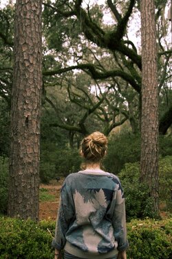
#2 That lens has bad bokeh on sticks and twigs. ALl that dead space frame left? Hurts the shot. She has a pretty dress on, but it's thrown away since the camra was "wide" when it should have been "tall"...we see out of focus bad-bokeh "sticks" and "bushes" and not much of her.

#3 It's a vertical....the trees are vertical...SHE is vertical, and wearing a camo jacket, shot from behind. Okay....does nothing for me.

#4 Again...lots of empty, dead space, nothing of interest, and then HER, with a lovely,lovely lace dress and painted face. Should have been a "tall". Period.

#5 it's shot as a tall, and she is standing up. Okay, basic subject pose/camera orientation coordination, check!!!! But...there is a "gutter" of empty green space that runs top to bottom of the frame, and she is off-center....the "gutter" kills the shot. Swing the camera over and put HER as the subject...

#6 Same fundamental issue as above: undesirable background and main subject off-centered so much that the balance of the photo is wayyyyyy right. The double-lock doors....okay....THEY are the main subject, and she is peripheral to them. her at the edges of the frame makes the image a competition between HER, and the door hardware. The hardware wins.
 
They are dull and lack vibrancy because they are in the wrong color space for web viewing.
Most web browsers assume pictures are in the sRGB color space, yours are in Adobe RGB.

Six is too many for c/c

You would get better, more useful c/c if you allowed editing.

Didn't realize that, I'm a noob here. And sorry, didn't know there was a limit to how many I could ask for C&C on, I see plenty of people post like 10 and get no issues
 
She's wearing some goodwill sweater, not a camo jacket. Blegh! Haha.
But thanks for the comments! Appreciate them

And she's sitting in a rocking chair in #5. The amount of limited space we had on that porch due to it being super stormy was ridiculous that day, where the doors were and such.
 
I totally see where you are coming from and I completely agree, but when she is in a photo shoot she honestly takes control of the aesthetics.
As for the doors, the house is not ours and I didn't have much to work with.
Thanks for the advice, I definitely agree with it.

Maybe that (taking control of the aesthetics) is something for you to work on as a photographer. You have to take control to achieve your vision. Do so in a way that still invites collaborative input from others working on the shoot, but it's your shoot, your vision, and you are the photographer.

And it's definitely something for HER to work on as a model. Models don't "take control of" anything on my shoots unless I ask them to, or unless they came to me with the concept in which case we're still at least equal partners in the process.

And if someone else is involved (like a paying client), then we both have to moderate and adjust our vision to their needs / ideas.
 
They are dull and lack vibrancy because they are in the wrong color space for web viewing.
Most web browsers assume pictures are in the sRGB color space, yours are in Adobe RGB.

Six is too many for c/c

You would get better, more useful c/c if you allowed editing.

Didn't realize that, I'm a noob here. And sorry, didn't know there was a limit to how many I could ask for C&C on, I see plenty of people post like 10 and get no issues

If you put up more than 2 then the comments get spread out among them, the comments are generally superficial and you don't get the detailed help that would really be useful.
If you allow editing then people can actually show you subtle things that are virtually impossible to describe in words.
 

Most reactions

New Topics

Back
Top