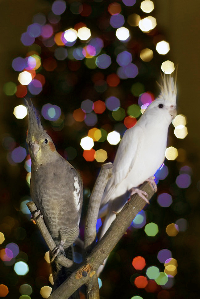
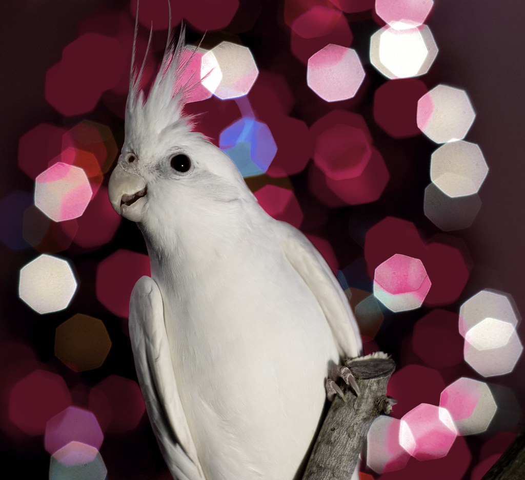
I tried editing in Photoshop. forgive my poor selection around the birds crests, I was simply doing a preliminary jpeg edit before I put too much time into it to do it right. Is this good or did I warm/ brighten too much/ too little, etc... In the second image, I played with the color adjustment tool in Aperture to get rid of most of the cool tones- I think it came out a bit too much like valentines day and not enough like christmas but it was fun to play with. Thank you again.
You sig shows OK to edit, so I gave it a shot. Been playing around with PP for the last few days. After some sharpening it seems focus is on the foot or at least my eyes get pulled there. Excuse my selection around the crest as well. I just added a very small amount of blur to the background to get the grain out of the OOF highlights and brought the exposure down .25 on the background. Some sharpening on the bird and curves tweaked.
You could have used a wider aperture. But you may have had to step back to get the DOF you want and then pull the lights farther back from subject to compensate for the gained DOF by stepping back. You may not have enough room to do either of those, I know I don't.





![[No title]](/data/xfmg/thumbnail/32/32933-a3726bc86a7c36fb222612f8aeab6b84.jpg?1734162721)