
rockangelphotography
TPF Noob!
- Joined
- Dec 22, 2008
- Messages
- 54
- Reaction score
- 0
- Location
- Frisco Tx
- Can others edit my Photos
- Photos OK to edit
Hello there! Here are a few images from my last glamour session...I am looking for some feedback on what i did well and what i can do to improve.
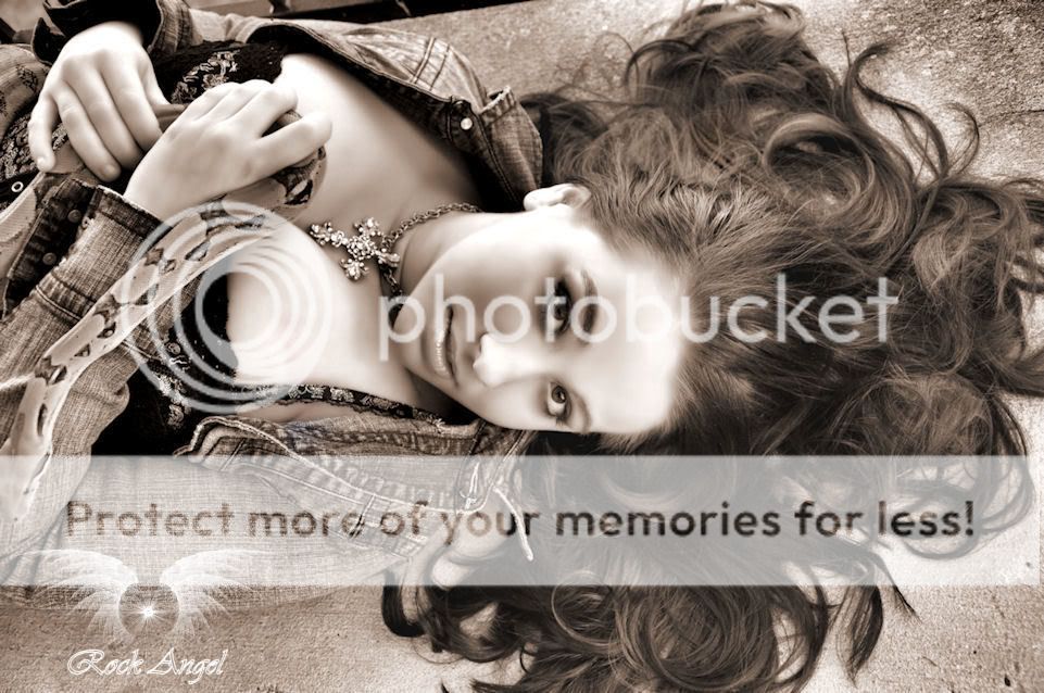
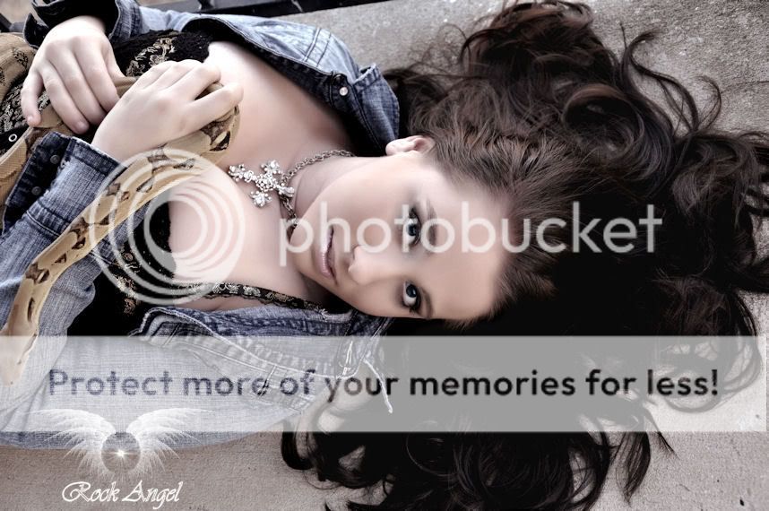
First i would like to start with these two images, I want to see which one most people prefer
1. Very Shopped
2. Less Shopped
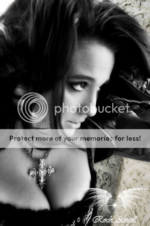
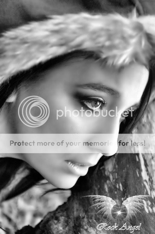
Aside from those I am just looking for some general feedback on a couple others, thank you!
3.
4.
First i would like to start with these two images, I want to see which one most people prefer
1. Very Shopped
2. Less Shopped
Aside from those I am just looking for some general feedback on a couple others, thank you!
3.
4.


![[No title]](/data/xfmg/thumbnail/30/30995-7e48e5498fe9a56ea3d405cf87f3a1ec.jpg?1619734558)
![[No title]](/data/xfmg/thumbnail/37/37520-d3e4d6582aa2781be7abf64e8651db45.jpg?1619738128)
![[No title]](/data/xfmg/thumbnail/32/32929-22e23acc63d6ecb25e5ee941be87121f.jpg?1619735758)
![[No title]](/data/xfmg/thumbnail/35/35965-cac1057a7f2dd8e8aeeefed50ae8c080.jpg?1619737282)
![[No title]](/data/xfmg/thumbnail/30/30992-773558233723ab0d28c307a97a1a2427.jpg?1619734556)
![[No title]](/data/xfmg/thumbnail/35/35968-01893eeb6a205c00827118fe5bb79703.jpg?1619737286)