My little sweetie at our Spring Mini Session C&C Werlcome

CorrieMichael

No longer a newbie, moving up!
Joined
Sep 28, 2012
Messages
447
Reaction score
166
Location
Canada
Can others edit my Photos
Photos OK to edit
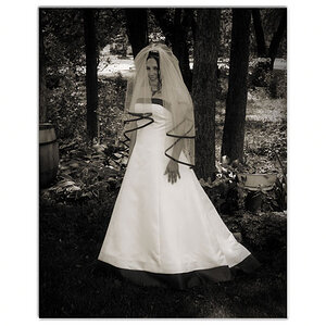
I would love some SERIOUS SERIOUS critique on these as I feel like they are some of my best to date! LOL Im asking for trouble aren't I! ♥

1. $IMG_0267cfblosvigclasrichbwlogo.jpg2.$IMG_0288logo.jpg3.$IMG_0297logo.jpg
 
#1 needs more smile.
#2 needs more eye contact.
#3 Needs less hat.

I'm rather ambivalent toward the monochrome conversion with a young child as subject. Model not centered and horizontal format don't add up to a good portrait. And the smile.

Same framing as the first did not help #2, even though she is smiling, which always helps.

Forcing the subject off center for no apparent reason is clumsy. Bright blue in the background is distracting. Cropping the hat might work in some circumstances, but since it is an integral part of this composition, you shouldn't crop it. Depth of field is too shallow to catch her hair in focus. And the hat over her eyes.

Perfect! Thanks!
 
Not sure how i feel about number one yet. It doesn't look bad to me but there's no detail left in the face. Number two is good but there's not much to break up the subject and background. There's a lot of that light brown tone throughout the image. Neither composition bothers me art all.

Number three is my favorite and is an awesome shot. I like what you do in post. Colors are vibrant and skin tones flattering. I also think the blue adds something to the photo. Great compliment to the yellows. Good job!

Thank you! ♥
 
The hat is so wide that I think the horizontal composition works.

The second would be excellent except that she's looking the wrong way -- "out" of the frame instead of "across" so the whole thing feels a little off kilter.

The first feels soft, the focus appears to be right but perhaps the shutter speed was low or something, or possibly some part of post squished it. The skin feels a little too hot to me too. I kind of dig the expression, though.

The third strikes me as excellent. If this is a crop, I would re-crop slightly looser, however. The hat is wonderful, we want to see it! Also, the flower on the wall (?) upper right is distracting. I would tone it down a bit, just desaturate a little bit, both the blue and the yellow, and maybe burn it down a little darker while you're at it. Somebody or other on here is fond of saying that your eye will go to the brightest thing in the frame, and this here is a pretty good example of the effect. A light touch should be enough to make this image much better,
 

Most reactions

New Topics

Back
Top