What's new

My portraits.

They're definitely interesting, and getting plenty of reactions good and bad. That's always the sign of something compelling in one way or another.

The second of the first set was really cool for me, personally.
 
I love desat, but I'd like to see a bit more contrast.
 
mocca said:
@WhiskeyTango,
Thank you for your feedback. I always try in my portraits to show more than just a beautiful model. I like when they express: anxiety, joy, a question. Photo should stop you, have something to tell. That is what I am trying and looking for. Treatment or finish is a question of taste, but I acknowledge that you did not like it. Thank you :)

@Hobbytog,Jowensphoto- thank you :)

Hold up where is the beautiful model?
 
sehr gut!!!
I really love your stuff. I would like a touch more contrast but that's really like salt and pepper - a personal choice.
tschüß
 
Thank you very much :)

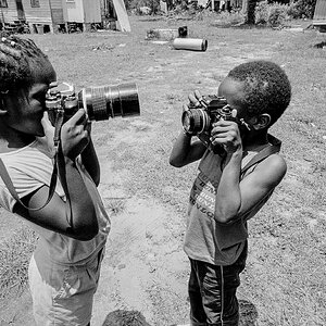
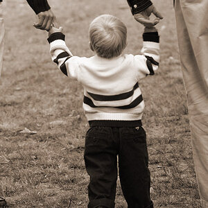
Children.

7
 
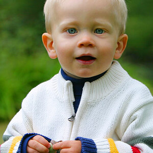
That's a very good composition in #7. Nice use of colour, too. Have you performed any selective desaturation in any of these?
 
Hello Jaemie :)
Yes, this selective desaturation.I got rid of the green, orange and a bit of the yellow.
 
I like them all, some more than others. I do like #1 quite a lot, it's unnerving and cool, almost paranormal in quality.

I really, really, really like #2 - but for as much as I like it, I hate the mottled weirdness over her body. #3, I also like, has a sort of uncanniness as well, but not as much as #1. #4 is just a little over the top, and is my least favorite.

5 and 6 are just great, and continue the set nicely.
 

Create an account or login to comment

You must be a member in order to leave a comment

Create account

Create an account on our community. It's easy!

Log in

Already have an account? Log in here.

New Topics

Back
Top Bottom