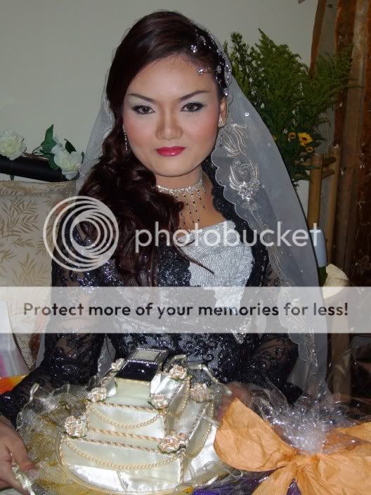
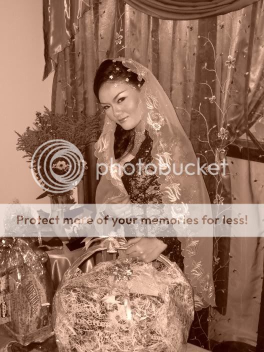
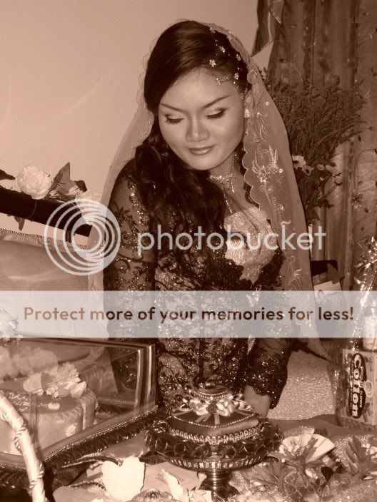
I agree, she looks very nice in #5, but I think there is just too much cluttering stuff around her going on. Perhaps you could crop some of that out? I feel the same about #4, she totally gets lost with all of the other visual stuff that's going on around her. BTW, she is very beautiful!
") . thanks guys
. thanks guys


![[No title]](/data/xfmg/thumbnail/30/30863-8c53522e4ed851e96cb7411e74b9fe59.jpg?1734158825)
![[No title]](/data/xfmg/thumbnail/41/41796-690c109012575e084970902dbd3894ba.jpg?1734176108)


![[No title]](/data/xfmg/thumbnail/42/42480-70a0d1b3ccdeb380098dd12f512b4a17.jpg?1734177006)
