
rlcphotos
TPF Noob!
- Joined
- Nov 23, 2007
- Messages
- 197
- Reaction score
- 0
- Location
- Western Pa.
- Can others edit my Photos
- Photos OK to edit
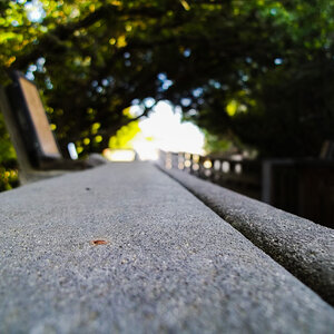
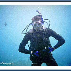
and bear in mind Im a rookie at this stuff, any creative comments are welcome.
http://rlcphotos.smugmug.com/
http://rlcphotos.smugmug.com/


![[No title]](/data/xfmg/thumbnail/38/38740-d1a7721cf77e9309a9b4a4829c65fdd4.jpg?1619738704)
![[No title]](/data/xfmg/thumbnail/32/32707-3c49d54a87afb53e65c60391858400be.jpg?1619735611)
![[No title]](/data/xfmg/thumbnail/38/38737-350089c7ae87f5c983c5362b9b78b671.jpg?1619738703)