What's new

Navy and Businessman shoot

Corey Jenkins

TPF Noob!
Joined
Oct 6, 2009
Messages
8
Reaction score
1
Location
North Carolina
I've wanted to do some military style portraits for a while and just got a chance to do it. We shot some basic stock businessman type stuff as well. The public transit shot I dont know what to think about, doesnt seem right lol I wanted to create a stock image that shows professional people using pub transportation. Maybe the pose isnt good and too cheesy? Anyway take a look and rip these up! I should have a few more up as I finish editing them.


1
_CJP6564-Editw-L.jpg


2
_CJP5763-Edit-2cW-L.jpg


3
_CJP5677-Editw-L.jpg


4
_CJP6444-EditW-L.jpg


Thanks!


Home
Facebook Fan Page
 
Ripping per req:

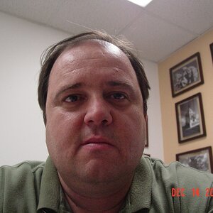
1. The first one is a good idea, but the blue gel doesn't work for me, and something is giving the impression that he needs a shave, which is NOT what any good sailor would look like.

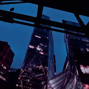
2. This is a good, well executed image, but it's NOT a portrait.

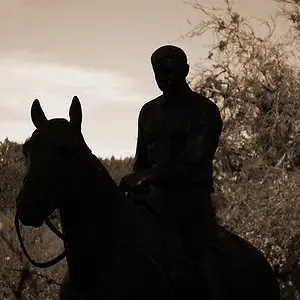
3. This is IMO, a strong image, but I don't get the "he's using public transportation" message, rather, "he's waiting for someone or something" message. I would suggest cropping most of the empty space behind him away.

4. Not overly fussed about this shot. I would prefer it shot at eye-level, and the highlights on his skin seem a touch hot, and the fall-off looks "wrong" to me.

Just my $00.02 worth - your mileage may vary.

~John
 
are this HDR? if so, how do you take muliple exposure shots with moving subjects?
 
I like the photos but I don't think you are getting the message across. Not what you typed anyways.
1. I like the pose but not the use of the blue gel.
2. cool shot but more of an action shot than a portrait.
3. This is my fav. but it doesn't make me think of someone using public transportation.
4. I like everything about it but I would like it more if everything stays the same and the face looking towards the camera.
 
I like the photos but I don't think you are getting the message across. Not what you typed anyways.
1. I like the pose but not the use of the blue gel.
2. cool shot but more of an action shot than a portrait.
3. This is my fav. but it doesn't make me think of someone using public transportation.
4. I like everything about it but I would like it more if everything stays the same and the face looking towards the camera.

I think he purposefully stylized the photos.

I personally like the first and last one. The second one is good but it's not really my thing, and the third does seem a little "fake." The model seems kind of zoned out of the whole scene, which makes the fact that it's a composite more obvious.

I really like the last one. It's not conventional but it has a fresh and modern feel. It's not that stuffy corporate/yearbook lighting that a lot of professionals turn to for these types of things.
 
they're all technically good shots for the most part.

I like the red/white/blue lighting you've got going on in #1, the blue may be a bit dominating, but it doesn't bother me. he is a sailor after all...the thing that bothers me the most about #1 is the 'shinyness' of his skin (a better term for it escapes me at the moment), especially on his lips, I think softening up the facial highlights would go a long way, and take the focus off his pores and get rid of the 'greasy' skin look (again, probably not the best terminology).

#2 is the strongest IMO, the red doorway seems to be grabbing my attention more than the subject though, perhaps darkening it up, or removing the red or something...would work great for a video game promotion or something

#3 I agree with tirediron on this, good, but doesn't make me think of public transportion, kinda feels like he's really excited about his new watch.

#4 a pretty good stock image, though I think bringing the camera up to eye level would help it, again, like tirediron mentioned.

great stuff though, keep 'em coming, I love military images.
 
I like the first shot. Try it again with some red light (or gel). I think it would really strengthen this shot. At night they "darken ship", and shift the lighting to red lights. I think it would look more realistic and maybe portray your message a bit better. Ask your model what he thinks.
 

Create an account or login to comment

You must be a member in order to leave a comment

Create account

Create an account on our community. It's easy!

Log in

Already have an account? Log in here.

New Topics

Back
Top Bottom