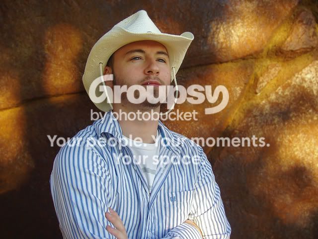
First one is great. I find the lip ring really distracting, maybe you can tone down the highlight on it a bit. You did a good job on getting his face (your face? self portrait?) completely in the shadow area. Thats the kind of thing I always forget to think about when I'm shooting.
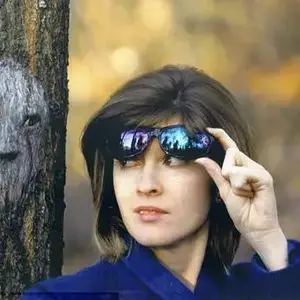
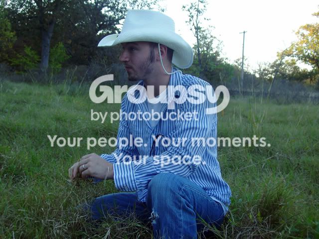
The composition in the second one is a little boring. It would be better if there were less room on the right and a little more on the left so that the subject has room to look, if that makes any sense. There are other things going on with that shot too, such as your exposure and colorcast, but I'm not sure what the best solution is for that.
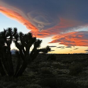
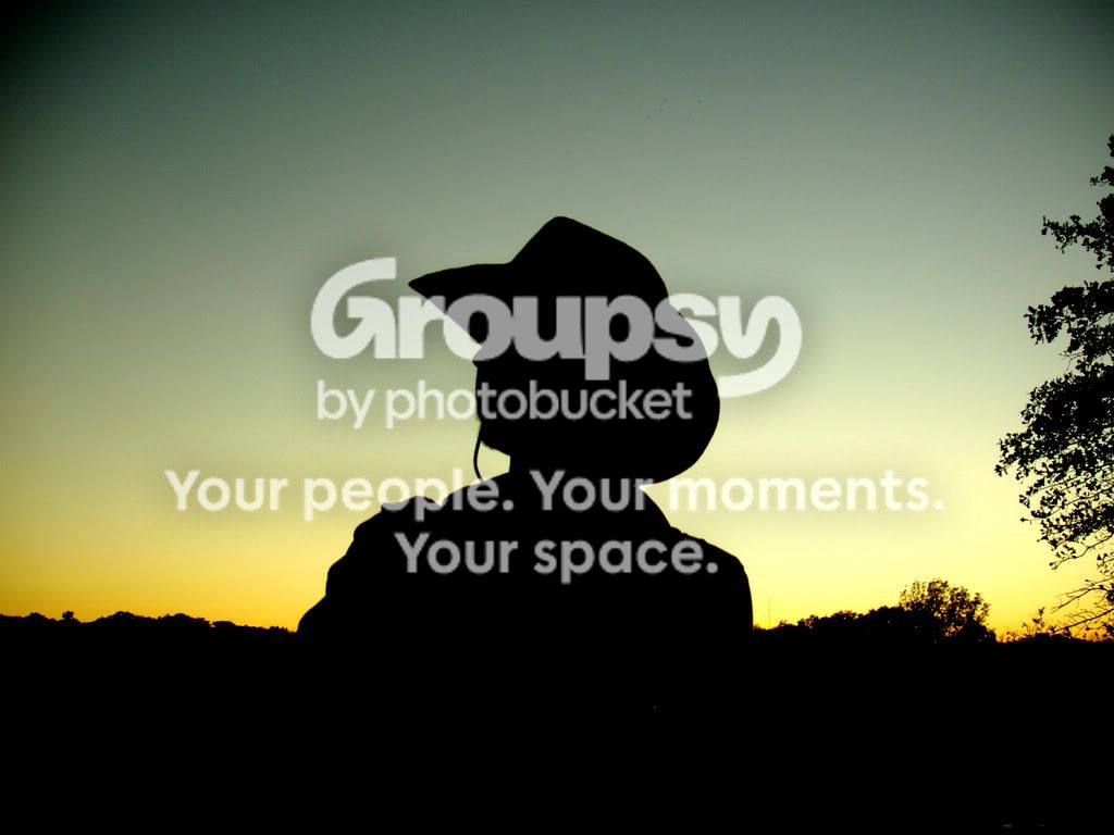
I love the last one. I think it could also benefit from cropping...crop the tree out on the right and then crop some of the excess black from the bottom. The colors are great though.
If you do a search on the rule of thirds, I think it will help you on your composition.



![[No title]](/data/xfmg/thumbnail/39/39657-59afb9b38e439b33906e81e4952470ac.jpg?1734173973)