What's new

Need an Opinion - Quick! :)

Which one has more of an impact?

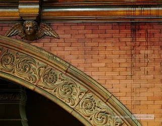
  • Angels in the Architecture

    Votes: 9 28.1%
  • Fire Escape

    Votes: 23 71.9%

  • Total voters
    32
Dead heat.

So, you're going to have to show both, one layered over the other, with an appropriate blending mode. :D
 
Well, I'll help push the scales a little bit apart. It's actually really close for me, but if these were mine, I think I'd pick #2 for some reasons that have already been said--more of a visual "impact," it's busy enough to keep you occupied and looking at all the angles and shadows, but (for me, at least) NOT so busy that it turns me off.
 
  • Thread Starter 🔹
  • Moderator 🛠️
  • #19
Looks like 2 is winning it, and that's even with some people not voting and only commenting.

To answer Mish's earlier question... I think 2 is technically a "better shot", but I always feel like it was basically shooting fish in a barrel. Too easy, too obvious.

Also, I'm a sucker for warm tones in a shot, so I'm naturally more drawn to #1.

Thanks for everyone's opinions so far. I have until about 5PM today to decide. :)
 
LOVE #2 , the chaos , the processing , everything . # 1 is nice but doesn't hit my senses like # 2 . My 2 cents ,
 
I voted for #2. I don't see it as "easy" or "obvious" - if anything those adjectives apply more to #1. However, I'm not judging based on whether it was either of those things; I just think #2 is a lot more interesting and makes you want to look at again, while #1 doesn't do that for me. #2 also conveys a sort of tension that is absent in #1. I don't have any sort of feelings looking at #1.
 
I voted #1, because I like the warm tones and because it's just simple. #2 is just busy to me.
 
I would say the 1st image, simply because angels have such a rich symbolism in architectural history. One can trace their use as ornate objects back to Europe.
 
Yeah, but... Architecture is about creating living space for humans, or changing a space to enable some aspect of human existence. There is a connection between the structures built and the use of the space thereby created. So in this sense, #2 speaks much more eloquently to me than does #1. The first image shows some very nice decorative elements, but does not, in my opinion make a relation to the space, and in that it is a weaker image. While the fire escapes (and the multiple shadows) do create a very busy image, I think it echoes a certain reality of the busy-ness of city life, and the complex interleaving of the many lives in those buildings.

 
#2 is extremely cliched (which might be a good thing?) but #1 isn't a very strong picture ;) I voted for #1, because, "DOWN WITH CLICHES" mainly.
 
It is not easy to choose between these two. I prefer no 1 because the colours, shapes and details work together very well here and give a distinct 'noble' classical feel. No 2 is good as well, but way too many lines produce a confusing composition. One has to look very closely to find dominating lines, I think it is not good for an architectural shot. But it is more 'modern' and will appeal to younger audience. No 1 is like a good old noble vine, no 2 is like a shot of some confusing shot in your vein. I think you should chose depending on the audience.
PS And I agree about the cliche in no 2.
 
I don't understand why #2 would be a cliche but #1 wouldn't. If I were looking at these at an architectural-themed fair, I would probably think the arch was the more obvious shot. I mean, who doesn't know that an arch is a significant element in architecture? (Okay, don't answer that because I don't really want to know the extent of the ignorance ;) But you'd at least expect people attending an architectural-themed fair to know this!)

The fire escape, on the other hand, would seem to indicate that the photographer was more thoughtful and went outside the boundaries of more classical architectural features to present a picture of something that no one ever really thinks of as 'architecture'.
 
#1 looks off level... probably an illusion caused by the curve... but it's not an illusion that adds anything to the image. Plus, it doesn't have the pop to hold attention.

Something I'm hanging on the wall, I want it to keep you looking.

So I say #2, which holds attention for a moment. But even so, #2 makes me wish there was some element to be found by looking closer. Like a cat on one of the balconies, or a flower pot, or something somwhere thats the "secret" in the image. Once I sort it all out and go through the entire scene, I'm left a little disappointed.

But I imagine printed w/ a wide black matboard it would still display great.
 
#2 is a cliche because the high contrast b&w scaffolding/ironwork/frameworks/fire-escapes thing has been done over and over. Now, like most cliches, it's been done a lot because it's pretty good. Cliches are often visually quite pleasing.

#1 isn't a cliche because, well, it hasn't been shot as often, eh? I feel like it's not very strong because it feels out of balance, because the visual thrust is up, to the left, and out of the frame - the cherubim (?) isn't visually strong enough to stop that flow, in my judgement, and it is somewhat flat looking. This, I feel, is a stronger variant:

$foo.webp

Cropped to place the cherubim(?) better to "close off" the visual thrust up and left, more contrast to increase drama, and the drippy lines on the right brought out to balance and close up the right side of the frame. Ot's pretty rough and the colors got uglified. Sorry.
 

Create an account or login to comment

You must be a member in order to leave a comment

Create account

Create an account on our community. It's easy!

Log in

Already have an account? Log in here.

New Topics

Back
Top Bottom