What's new

Need Expert constructive critique for my work

digmont

TPF Noob!
Joined
Mar 12, 2014
Messages
15
Reaction score
0
Location
India
Can others edit my Photos
Photos OK to edit
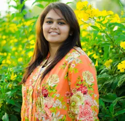
Hello photography experts out there, I heartily respect the hardwork and creative work all the expert photographers doing, here I am sharing the picture I've taken today evening, I need expert critiques on this picture like how could have this picture taken better with different settings on camera.. I have done some Post on this picture using lightroom like saturation, and eye lightning, teeth whitening, also need some advise regarding how to retouch skin, eyes and lips and make your subject pop.
Regards,
Digmont.

$final.webp

EXIF:
Lens: 50mm nikkor 1.8G
ISO: 100
Shutter Speed: 1/400
Aperture: f/1.8
Tripod : NO
 
Critique per req: The image, as-is, is not bad. The immediate point of improvement that I would recomemnd is cropping the left-hand side to remove the pathway. Right now, because it's a lighter aera, this is acting as a leading line and pulling the viewer's eye away from the subject. This will also give the image a square crop, which, IMO, will work well. Generally speaking, images like this are best shot in portrait (vertical) orientation.

I think I would have been tempted to have her turn her body a bit more toward the camera and not lean her head quite so far forward. As for processing, that's very much a matter of personal taste, and I think that with this, all I would do is brighten the eyes and maybe apply a very minor skin smoothing. There are a million tutorials for this sort of thing available on YouTube.
 
^^agree with John on this. The square crop I believe will help out as much as anything without re-shooting the portrait.
 
The light quality and direction leave some to be desired because her face seems under exposed and she has dark eye sockets. A reflector for fill light would add light to her face and eye sockets.

It looks like you whitened the sclera in her eyes but didn't whiten her teeth.

John mentioned the pose and composition issues.

I would not use that lens wide open for portraits.
Stopped down to f/3.5 to f/5.6 will add noticeable sharpness.
The DoF will get somewhat deeper in that range of apertures but if you rotate the camera to the portrait orientation you can get a bit closer to your subject and the closer point of focus distance will regain some of the lost DoF shallowness.

Frankly I don't recommend using 50 mm as a portrait lens with just 1 subject, and recommend using 85 mm or an even longer focal length whenever possible.
 
Saturation is too high. Plants aren't nearly that green usually, and more importantly, it distracts from the face.

I would not use that lens wide open for portraits.
Stopped down to f/3.5 to f/5.6 will add noticeable sharpness.
The DoF will get somewhat deeper in that range of apertures but if you rotate the camera to the portrait orientation you can get a bit closer to your subject and the closer point of focus distance will regain some of the lost DoF shallowness.[FONT=Verdana, Arial, Tahoma, Calibri, Geneva, sans-serif]
[/FONT]

[FONT=Verdana, Arial, Tahoma, Calibri, Geneva, sans-serif]*raise eyebrow*[/FONT]
[FONT=Verdana, Arial, Tahoma, Calibri, Geneva, sans-serif]Getting closer messes up the perspective and exaggerates noses, etc., which is generally more important than sharpness in a non-fine-art portrait like this one, where subjects often don't even WANT their faces to be tack sharp in the first place.

If ever there were a time to use a lens wide open, it's for portraits like this one.
[/FONT]
 
thanks john for your valuable reply.. Respect!
 
$finala.webp

My edit. I would say my biggest issue is the posing. The way her should is position is unflattering for her body type.

As for the lens, well 50mm on a crop is damn near 80mm. I have done hundreds of headshots with that exact lens at near wide open and haven't had any sharpness issues. I would say that the focus was missed.
 
I would not use that lens wide open for portraits.
Stopped down to f/3.5 to f/5.6 will add noticeable sharpness.
The DoF will get somewhat deeper in that range of apertures but if you rotate the camera to the portrait orientation you can get a bit closer to your subject and the closer point of focus distance will regain some of the lost DoF shallowness.

Frankly I don't recommend using 50 mm as a portrait lens with just 1 subject, and recommend using 85 mm or an even longer focal length whenever possible.

Dude , not everybody has that much budget of buying 85mm and some other required equipments. I think one should come out with the best with whatever they've got.
and yes agree with Gavjenks, Getting closer messes up the perspective and exaggerates noses, etc. anyways thanks for your concern.
Regards,
Digmont.
 
Here's the second Image .. what you think of this ?
$final-2.webp
 
One step to the left might have eliminated the path and make the background simpler. Over all I like it, a touch less saturation. I like the pose of the first pic and background of the second. Good job.

Sent from my iPad using PhotoForum
 
Here's the second Image .. what you think of this ?
View attachment 68449

it's better.

I'd crop it inward a bit to make it a more traditional portrait orientation.

She's still looking down on the camera, and that's putting your horizon level way too high on the frame as well. Back off the flowers a few steps and move the camera up a bit so you can get some sky in the frame and throw the BG further out of focus.

Then you really need to work on your WB.
 
Here's the second Image .. what you think of this ?
View attachment 68449
I like this much better; the head and body position are good. My one suggestion would be, in future, watch your shooting angle. In this imae you were low and shooting up which puts the subject in a superior position (She's "looking" down on the viewer). This is fine for things like portraits of CEOs and such, but generally isn't ideal for images of this sort. Try and shoot right at eye-level, or only slight above or below.
 
I have one more question .. how to make this kind of portraits more better in post ? .. "what I think is" to keep it simple and natural .. no artificial lighting or manipulations or over saturation .. "but what experts think ?" what is a good idea to make this kinda portraits looks "wow" ? what should I work on ? (as in what special effects should I apply ? as in saturation, hue shifts, lens flares etc ..) or just keep it simple and natural ? any photoshop fanatics and experts can give me some ideas :)
here I am posting one more image, I need critiques and some post tips to work on.
Regards,
Digmont.

$DSC_00256.webp
 
To add to what has been said already,
The color scheme here is rather motley and haphazard - it is all leafs and flowers, in the background as well as on her dress. We have bright and rather unpleasant clash of colours and shapes here that detracts from the subject. As a result she is blending with the background like a paratrooper in a wrong colour camouflage. You should have put her further away from the background, and I mean much further away. You will be able to use a smaller aperture and still blur the background more than you do here. I do not like the background here, it is not blurred enough, you need a nice smooth bokeh for the subject to "pop". She is not slim, so shooting from below eye level makes her body look disproportionally big. No space above her head does not help either.
 
Last edited:
how to make this kind of portraits more better in post ?
That's honestly for you to decide.

"what I think is" to keep it simple and natural .. no artificial lighting or manipulations or over saturation ..
If that's your mantra, go for it. You can start by reducing all the clipped yellows in the picture so it's more natural and not oversaturated.

what is a good idea to make this kinda portraits looks "wow" ? what should I work on ?
A few ideas have been suggested. A lot of it is technique and a good deal of it is personal style. One thing I like doing is finding someone that shoots portraits how I would like mine to look and figure out how they are done and copy that.

(as in what special effects should I apply ? as in saturation, hue shifts, lens flares etc ..) or just keep it simple and natural ?
this is for you to decide. We have a few members here that put a LOT of post work into their portraits and they are great, we also have a few members here that reject anything but natural light/editing for their portraits and they are great.

any photoshop fanatics and experts can give me some ideas :)
skip photoshop for now and work in a "Photo Developing" program and not a pixel manipulation program.

I took a stab at it for no particular reason. I cropped it, removed the distracting background so it appears to have a horizon, sharpened it, and then fooled with the colors to give it a "style". This is not how I would have done my own image, but illustrates a look/feel you might want to achieve. Mainly I wanted to represent what I was talking about when I said the bg was distracting and something you can "fix" when taking the picture.

$DSC_00256.webp

I need critiques and some post tips to work on.

From a technical standpoint this image appears to be missed focus for one. There's no detail in her face/eyes, and the purple fringing on her teeth and sharp hair behind her face suggests the focus is behind her. Applying any sharpening would help here.

You shot her between you and the sun, which made for a great halo effect around her arm/hair, but her face could have used a reflector/fill. This would have helped to bring down your iso (there's a bit of noise when I look full size).

The WB seems really off to me and the yellows very oversaturated.

What good is that she's a lovely model and doesn't appear to be camera shy at all. These shots aren't bad by any stretch of the imagination, but there's still more you can do to take them from good to great. Work on your technique first. The better you can make the image in camera, the less you have to do to "save" it in post.

While I'm not saying post is bad (I apply heavy post work to my images), a lot of people are trending to take mediocre photos using little technique, and then processing the ever living crap out of them, in a very cliche way (e.g., len flares, hue shifts) in order to make their sub-par photography look good.

Take a look at the shots Paige posts here, or her flickr, she's into the muted color, soft black/matte look. That's just her style, and that works for her. But if you took that away from her pictures, they'd still be good pictures--they are well composed and well exposed--but they'd lack what makes them a Paige photo.

Read up, and get back out there.
 
Last edited:

Most reactions

Back
Top Bottom